2040 Official Community Plan - Form & Character
Low & Mid-Rise Residential Mixed Use

4.0 Low & mid-rise residential & mixed use
Overview |
|
General Characteristics |
|
In order to achieve the design goals of the City, all low and mid-rise residential and mixed use projects must:
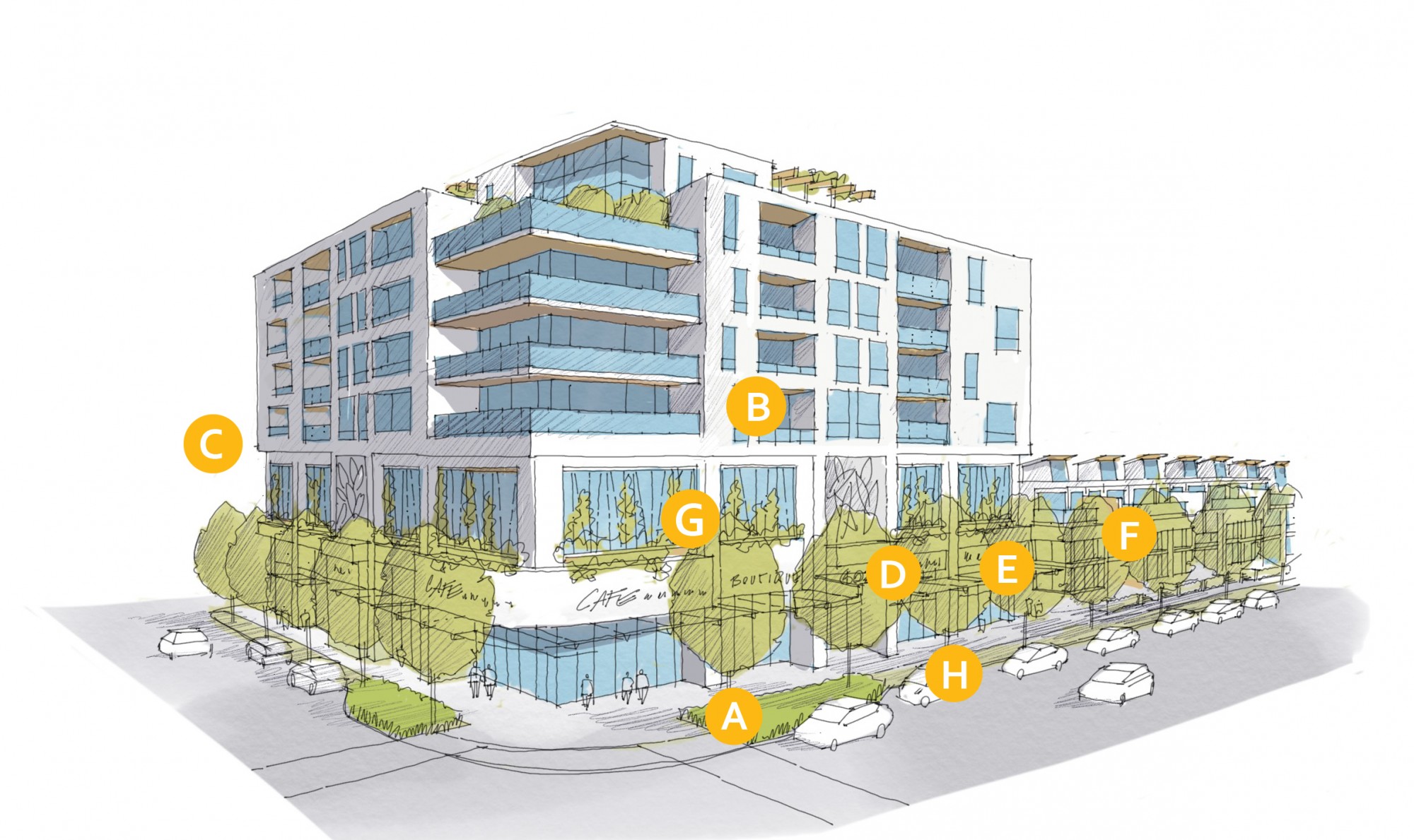
| A | 4.1.0 a – Provide attractive and active human-scale amenities oriented towards public spaces at grade such as a frequent entries, weather protection, and outdoor seating areas (see 4.1.1 and 4.1.5). |
| B | 4.1.0 b – Break up building mass by providing simple vertical and horizontal articulation of facades; e.g., step-backs, insets, projections, color and texture (see 4.1.6). |
| C | 4.1.0 c – Ensure buildings have a front-to-back orientation to streets and open spaces with back-of-house uses located to the rear of buildings to minimize impacts on public open spaces (see 4.1.3). |
| D | 4.1.0 d – Orient entries, windows, patios and balconies to face the fronting street. Ensure primary building entries are architecturally emphasized and directly accessible from the fronting public sidewalk (see 4.1.1). |
| E | 4.1.0 e – Maximize ‘eyes on the street’ by avoiding blank walls and providing direct lines of sight from windows and balconies to the sidewalk and adjacent public spaces (see 4.1.1 and 4.1.5). |
| F | 4.1.0 f – Provide access to underground or above ground on-site parking from secondary streets or lanes (see 4.1.4). |
| G | 4.1.0 g – When structured above grade parking is required due to the high water table, use store fronts or screening to mitigate visual impacts (see 4.1.4). |
| H | 4.1.0 h – Integrate semi-private open space with the surrounding streetscape (see 4.1.5). |
Design Intent: To site and design buildings to positively frame and activate streets and public open spaces.
Guidelines
In addition to the strategies outlined in the General Residential and Mixed Use Guidelines:
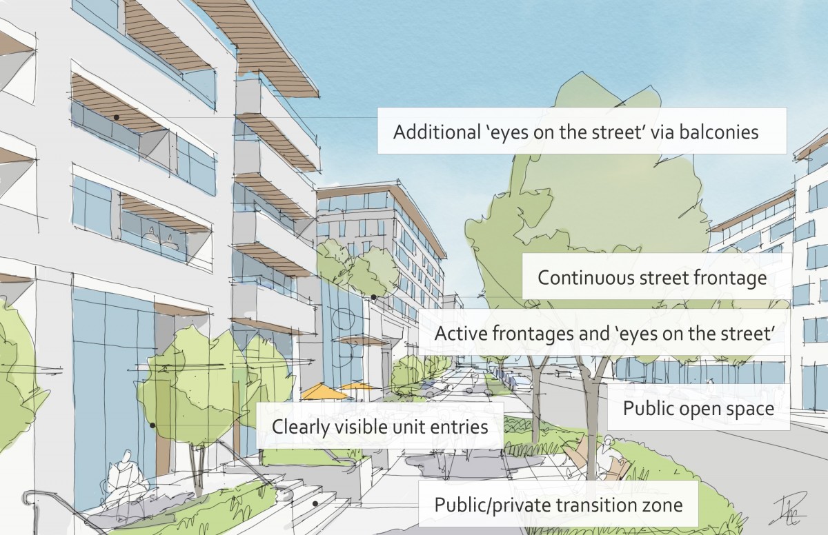
- Ensure lobbies and main building entries are clearly visible from the fronting street.
- Avoid blank walls at grade wherever possible by:
- Locating enclosed parking garages away from street frontages or public open spaces;
- Using ground-oriented units and entries or glazing to avoid creating dead frontages; and
- When unavoidable, screen blank walls with landscaping or incorporate a patio cafe or special materials to make them more visually interesting.
Commercial & Mixed Use Buildings
- Ensure buildings have a continuous active and transparent retail frontage at grade to provide a visual connection between the public and private realm.
- Site buildings using a common ‘build to’ line at or near the front property line so that a continuous street frontage is maintained. Some variation (1-3m maximum) can be accommodated in ground level set backs to support pedestrian and retail activity by, for example, incorporating a recessed entryway, small entry plaza, or sidewalk cafe (See Figure 27).
- Incorporate frequent entrances (every 15 m maximum) into commercial street frontages to create punctuation and rhythm along the street, visual interest, and support pedestrian activity (See Figure 28).
Residential and Mixed use Buildings
- Set back residential buildings on the ground floor between 3-5m from the property line to create a semi-private entry or transition zone to individual units and to allow for an elevated front entryway or raised patio.
- A maximum 1.2m height (e.g., 5-6 steps) is desired for front entryways.
- Exceptions can be made in cases where the water table requires this to be higher. In these cases, provide a larger patio and screen parking with ramps, stairs and landscaping.
- Incorporate individual entrances to ground floor units accessible from the fronting street or public open spaces.
- Site and orient buildings so that windows and balconies overlook public streets, parks, walkways, and shared amenity spaces while minimizing views into private residences.
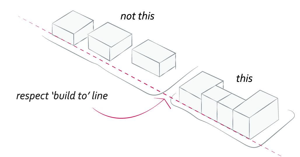 |
| Figure 27: Site buildings with commercial frontages continuously using a common ‘build to’ line (4.1.1 d). |
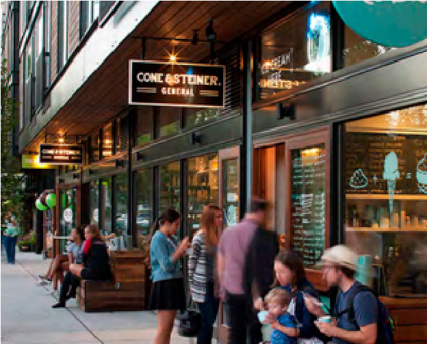 |
| Figure 28: In mixed-use projects, incorporate frequent entrances into commercial street frontages (4.1.1 e). |
Street Interface | ||
| These conceptual elevation diagrams illustrate three common street interface scenarios for low and mid-rise mixed use and residential buildings. | ||
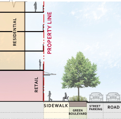 | 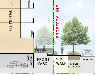 | 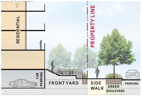 |
| Figure 29: Mixed use with ground level retail | Figure 30: Residential with underground parking | Figure 31: Residential with half underground parking |
Design Intent: To ensure buildings contribute positively to the neighbourhood context and provide a sensitive transition in scale to existing and future buildings, parks, and open spaces.
Guidelines
In addition to the strategies outlined in the General Residential and Mixed Use Guidelines:
- Residential building facades should have a maximum length of 60m. A length of 40m is preferred.
- Residential buildings should have a maximum width of 24m.
- Buildings over 40m in length should incorporate a significant horizontal and vertical break in the facade (See Figure 33).
- For commercial facades, incorporate a significant break at intervals of approximately 35m.
Seven to twelve storey buildings
- Buildings between seven and twelve storeys should:
- Incorporate a 2-3 storey podium at the base of the building (see 4.1.1 c-e for commercial interface guidelines and 4.1.1 f-i for residential interface guidelines);
- Incorporate a minimum 2m stepback in upper storeys, and more generous upper storey terraces facing south and west (See Figure 32); and,
- Have a minimum 30m building separation between primary building facades.
- Courtyards and mid-block connections within building sideyards should be a minimum of 6m wide.
- To support and promote the use of mass timber construction, exceptions to setbacks and podium design guidelines will be considered to accommodate unique design challenges and technical requirements.
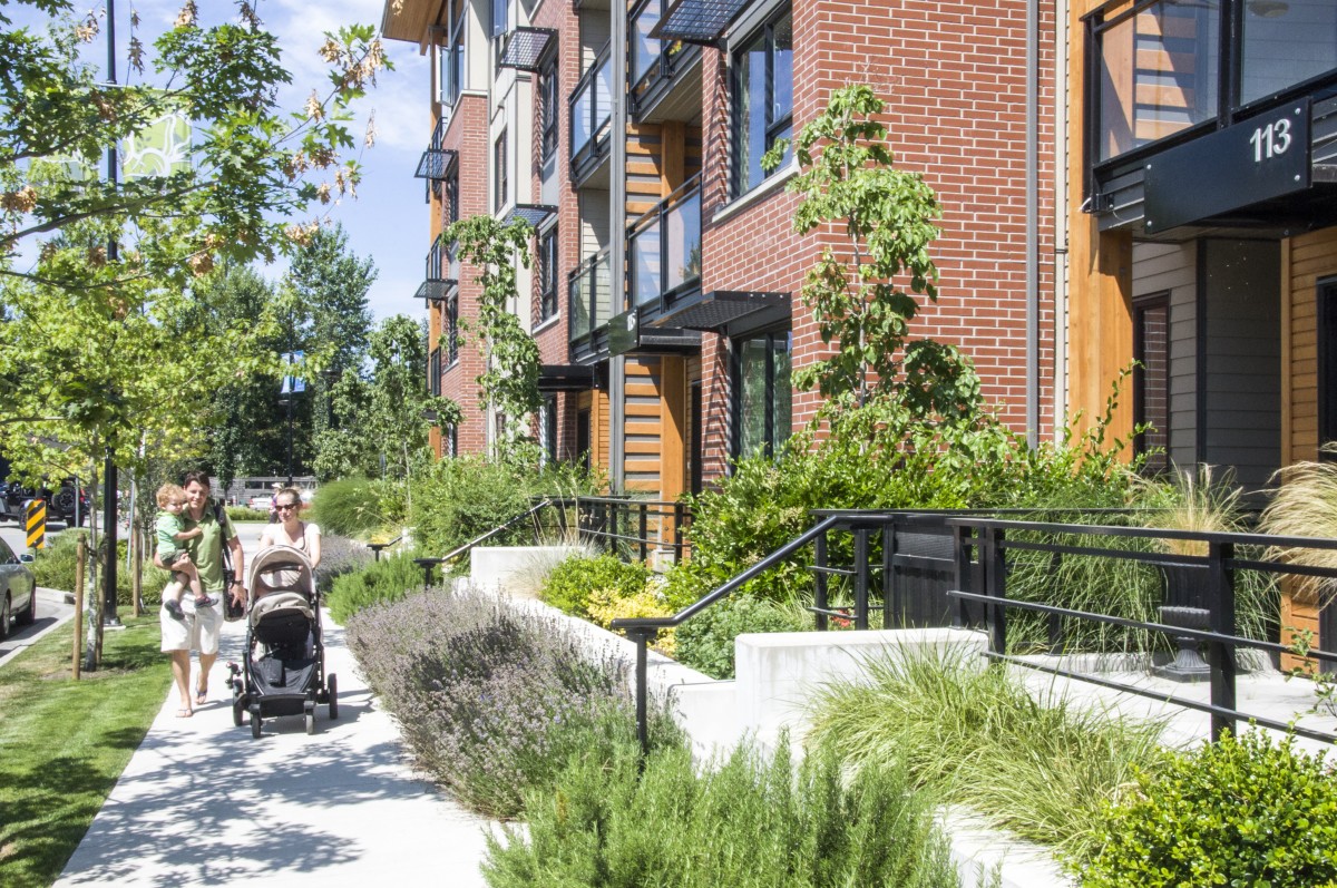 |
| Figure 32: Example of a raised residential frontage with semi private patios over half underground parking (see also Figure 31). |
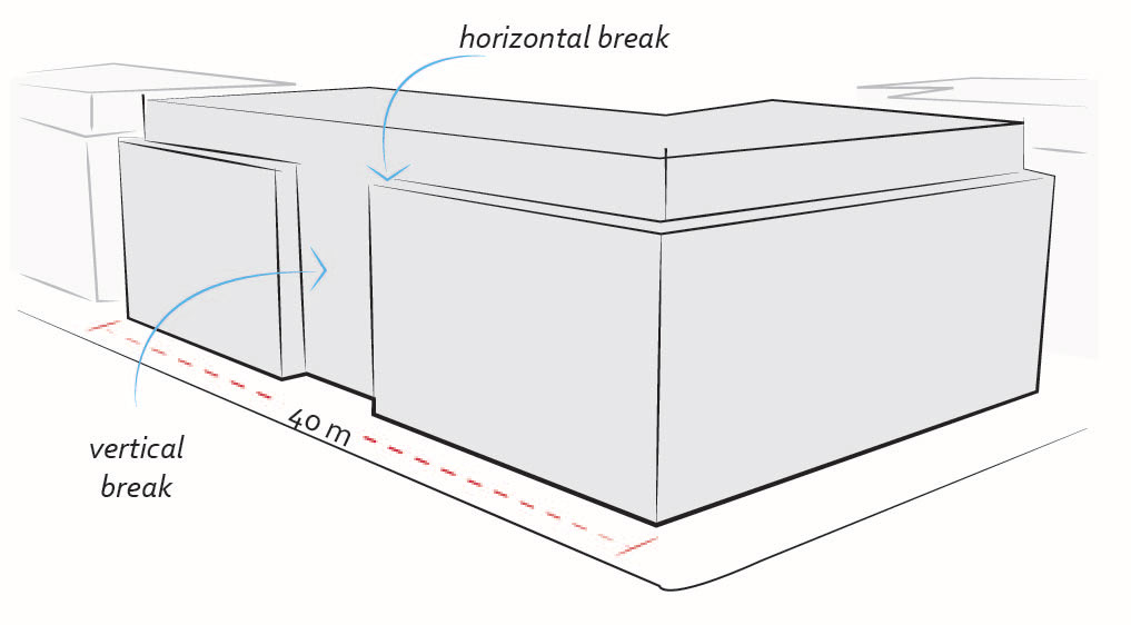 |
| Figure 33: Buildings over 40m in length should incorporate a significant horizontal and vertical break in the facade (4.1.2 c). |
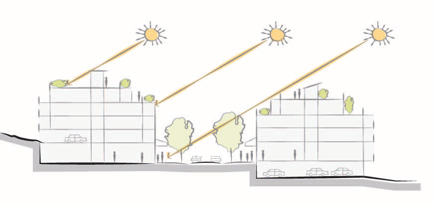 |
| Figure 34: Upper storeys of buildings should step back to reduce visual impact and shadows on the public realm (4.1.2. d). |
Design Intent: To site buildings to respond sensitively to topography and environmental features; to enhance privacy, liveability, safety and accessibility; and to increase connectivity to the surrounding open space network.
Guidelines
In addition to the strategies outlined in the General Residential and Mixed Use Guidelines:
- On sloping sites, floor levels should step to follow natural grade and avoid the creation of blank walls.
- Site buildings to be parallel to the street and to have a distinct front-to-back orientation to public street and open spaces and to rear yards, parking, and/or interior court yards:
- Building sides that interface with streets, mid-block connections, and other open spaces (building fronts) should positively frame and activate streets and open spaces and support pedestrian activity (See Figure 35); and
- Building sides that are located away from open spaces (building backs) should be designed for private/shared outdoor spaces and vehicle access.
Connectivity
- Break up large buildings with mid-block connections which should be publicly-accessible wherever possible.
- Ground floors adjacent to mid-block connections should have entrances and windows facing the mid-block connection (See Figure 35).
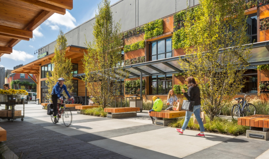 |
| Figure 35: Example of a mid-block connection with seating, landscaping, and active frontages (4.1.3 b & d). |
Design Intent: To ensure the provision of adequate servicing, vehicle access, and parking while minimizing adverse impacts on the comfort, safety and attractiveness of the public realm.
Guidelines
In addition to the strategies outlined in the General Residential and Mixed Use Guidelines:
- Vehicular access should be from the lane (See Figure 36). Where there is no lane, and where the re-introduction of a lane is difficult or not possible, access may be provided from the street, provided:
- Access is from a secondary street, where possible, or from the long face of the block;
- Impacts on pedestrians and the streetscape is minimized; and,
- There is no more than one curb cut per property.
- Above grade structure parking should only be provided in instances where the site or high water table does not allow for other parking forms and should be designed in accordance with 5.1.4 b.
- Buildings with ground floor residential may integrate half-storey underground parking to a maximum of 1.2m above grade, with the following considerations:
- Semi-private spaces should be located above to soften the edge and be at a comfortable distance from street activity; and.
- Where conditions such as the high water table do not allow for this condition, up to 2m is permitted, provided that entryways, stairs, landscaped terraces, and patios are integrated and that blank walls and barriers to accessibility are minimized (See Figure 31).
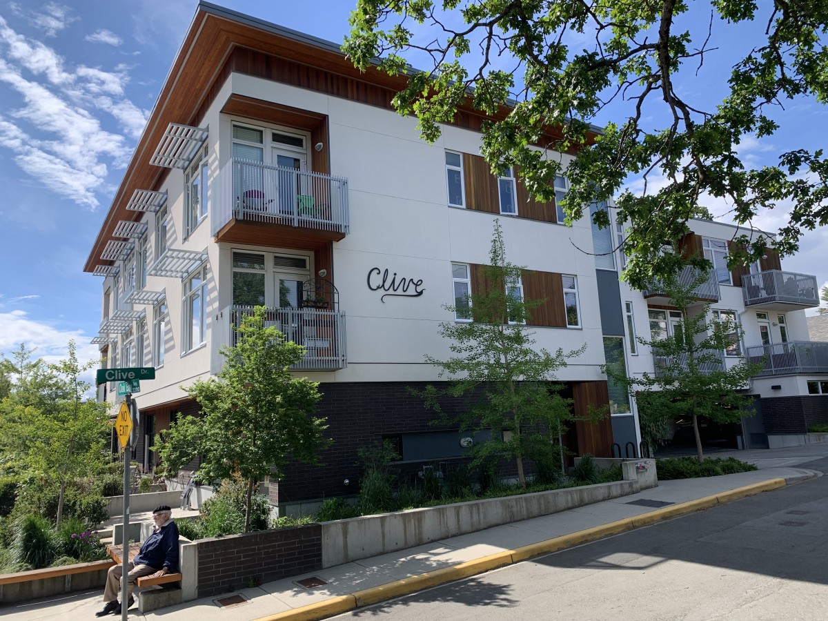 |
| Figure 36: Provide access to parking from the lane or secondary street, and integrate vehicular entrances into the building (4.1.4 a). |
Design Intent: To design landscapes and open spaces to respond to an open space program that relates to its users and provides flexible, accessible open space.
Guidelines
In addition to the strategies outlined in the General Residential and Mixed Use Guidelines:
- Integrate publicly accessible private spaces (e.g,. private courtyards accessible and available to the public) with public open areas to create seamless, contiguous spaces (See Figure 37).
- Locate semi-private open spaces to maximize sunlight penetration, minimize noise disruptions, and minimize ‘overlook’ from adjacent units.
Outdoor amenity areas
- Design plazas and urban parks to:
- Contain ‘three edges’ (e.g., building frontage on three sides) where possible and be sized to accommodate a variety of activities;
- Be animated with active uses at the ground level; and,
- Be located in sunny, south facing areas.
- Design internal courtyards to:
- Provide amenities such as play areas, barbecues, and outdoor seating where appropriate.
- Provide a balance of hardscape and softscape areas to meet the specific needs of surrounding residents and/or users.
- Design mid-block connections to include active frontages, seating and landscaping.
Rooftop Amenity Spaces
- Design shared rooftop amenity spaces (such as outdoor recreation space and rooftop gardens on the top of a parkade; see Figure 38) to be accessible to residents and to ensure a balance of amenity and privacy by:
- Limiting sight lines from overlooking residential units to outdoor amenity space areas through the use of pergolas or covered areas where privacy is desired; and
- Controlling sight lines from the outdoor amenity space into adjacent or nearby residential units by using fencing, landscaping, or architectural screening.
- Reduce the heat island effect by including plants or designing a green roof, with the following considerations:
- Secure trees and tall shrubs to the roof deck; and
- Ensure soil depths and types are appropriate for proposed plants and ensure drainage is accommodated.
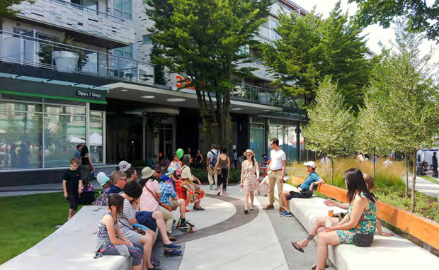 |
| Figure 37: Example of active uses at grade with public realm elements integrated in a front courtyard (4.1.5 a). |
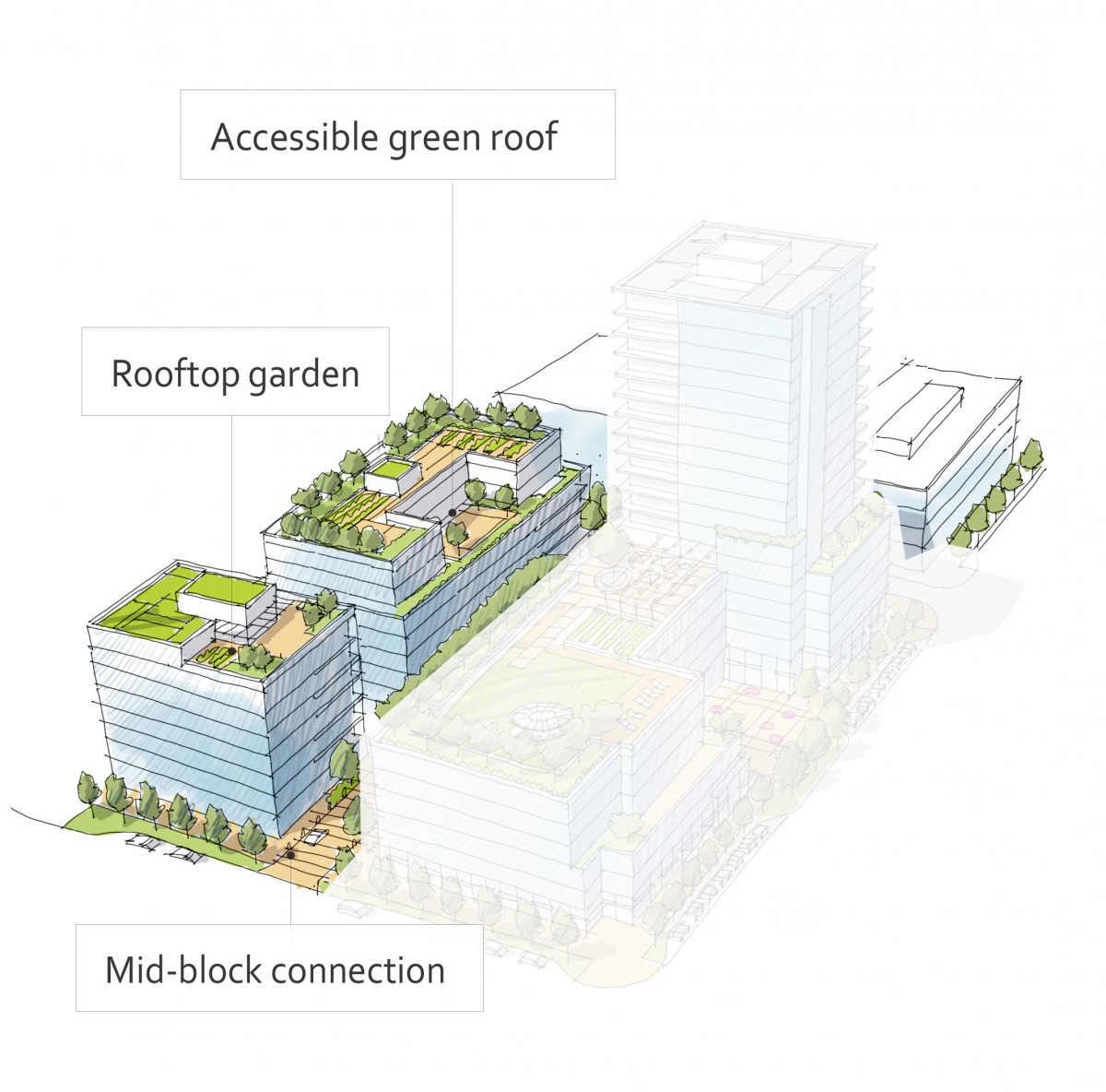 |
| Figure 38: Examples of outdoor amenity space in a mid-rise building (4.1.5 f). |
Design Intent: To enhance liveability, visual interest, identity, and sense of place through building form, architectural composition, and materials.
Guidelines
In addition to the strategies outlined in the General Residential and Mixed Use Guidelines:
- Articulate building facades into intervals that are a maximum of 15m wide for mixed-use buildings and 20m wide for residential buildings. Strategies for articulating buildings should consider the potential impacts on energy performance (see 2.2.1), and include (See Figure 39):
- Façade Modulation – stepping back or extending forward a portion of the façade to create a series of intervals in the facade;
- Repeating window patterns at intervals that correspond to extensions and step backs (articulation) in the building facade;
- Providing a porch, patio, deck, or covered entry for each interval;
- Providing a bay window or balcony for each interval, while balancing the significant potential for heat loss through thermal bridge connections which could impact energy performance;
- Changing the roof line by alternating dormers, stepped roofs, gables, or other roof elements to reinforce the modulation or articulation interval;
- Changing the materials with the change in building plane; and
- Provide a lighting fixture, trellis, tree, or other landscape feature within each interval.
- Break up the building mass by incorporating elements that define a building’s base, middle and top.
- Use an integrated, consistent range of materials and colors and provide variety by, for example, using accent colors (See Figure 40).
- Articulate the facade using design elements that are inherent to the building as opposed to being decorative. For example, create depth in building facades by recessing window frames or partially recessing balconies to allow shadows to add detail and variety as a byproduct of massing.
- Incorporate distinct architectural treatments for corner sites and highly visible buildings such as varying the roofline (See Figure 41), articulating the facade, adding pedestrian space, increasing the number and size of windows, and adding awnings and canopies.
Weather protection
- Provide weather protection (e.g. awnings, canopies, overhangs, etc.) along all commercial streets and plazas (See Figure 42), with particular attention to the following locations:
- Primary building entrances,
- Adjacent to bus zones and street corners where people wait for traffic lights;
- Over store fronts and display windows; and
- Any other areas where significant waiting or browsing by people occurs.
- Architecturally-integrate awnings, canopies, and overhangs to the building and incorporate architectural design features of buildings from which they are supported.
- Place and locate awnings and canopies to reflect the building’s architecture and fenestration pattern.
- Place awnings and canopies to balance weather protection with daylight penetration. Avoid continuous opaque canopies that run the full length of facades.
Signage
- Provide attractive signage on commercial buildings that identifies uses and shops clearly but which is scaled to the pedestrian rather than the motorist. Some exceptions can be made for buildings located on highways and/or major arterials in alignment with the City’s Sign Bylaw (See Figure 42).
- Avoid the following types of signage:
- Internally lit plastic box signs;
- Pylon (stand alone) signs; and
- Rooftop signs.
- Uniquely branded or colored signs are encouraged to help establish a special character to different neighbourhoods.
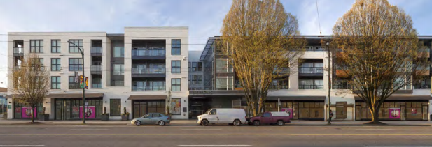 |
| Figure 39: An example of breaking down a long building facade, using recesses to articulate the facade and allow shadows to add detail and variety (4.1.6 a). |
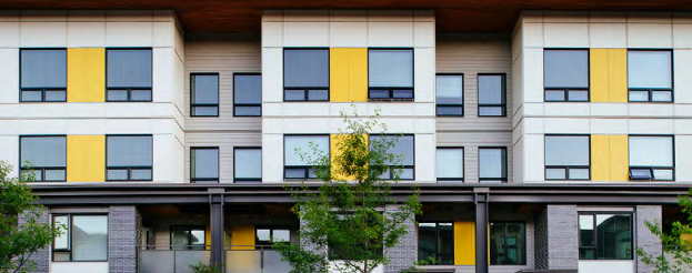 |
| Figure 40: Example of the use of accent color to augment a simple and consistent material palette (4.1.6 c). |
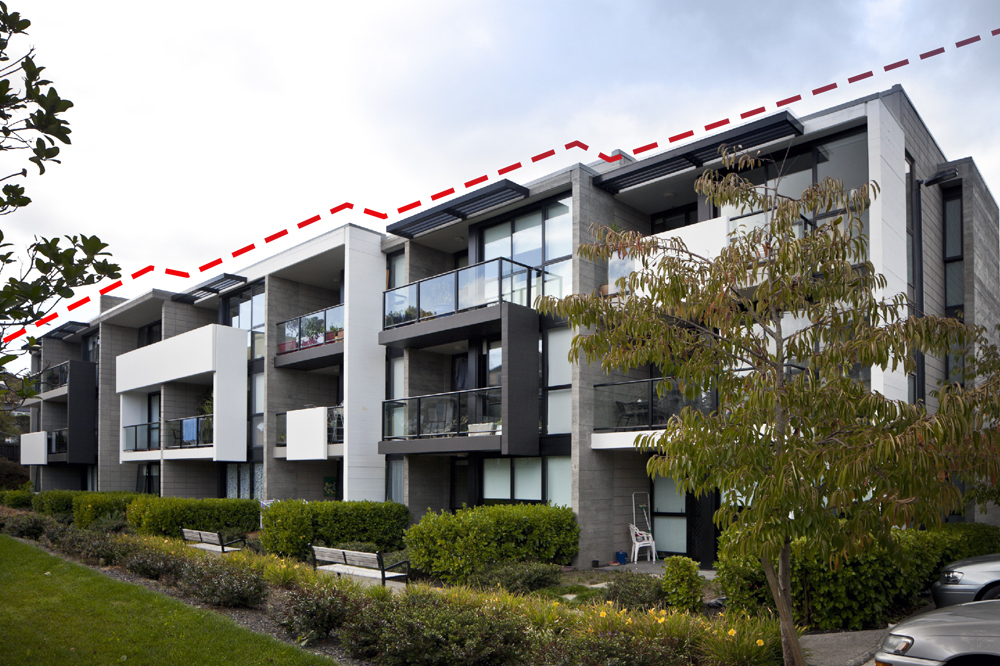 |
| Figure 41: A residential building’s roof form is stepped to break up the overall form (4.1.6 e). |
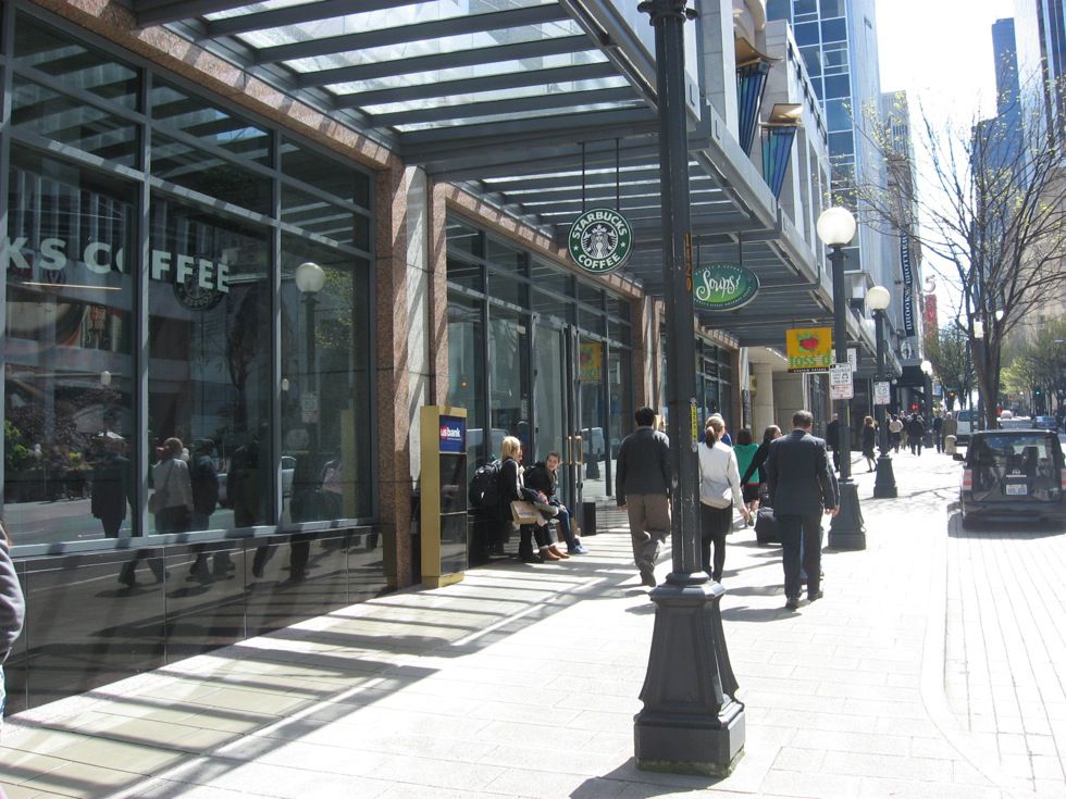 |
| Figure 42: Weather protection and clear signage should be provided along all commercial streets and plazas, and be architecturally-integrated to reflect the pattern of shop fronts and upper storey fenestration/articulation (4.1.6 f-j). |


