2040 Official Community Plan - Form & Character
High-rise Residential and Mixed Use

5.0 High-rise Residential & Mixed Use
Overview |
|
General Characteristics |
|
In order to achieve the design goals of the City, all high-rise residential and mixed use projects must:
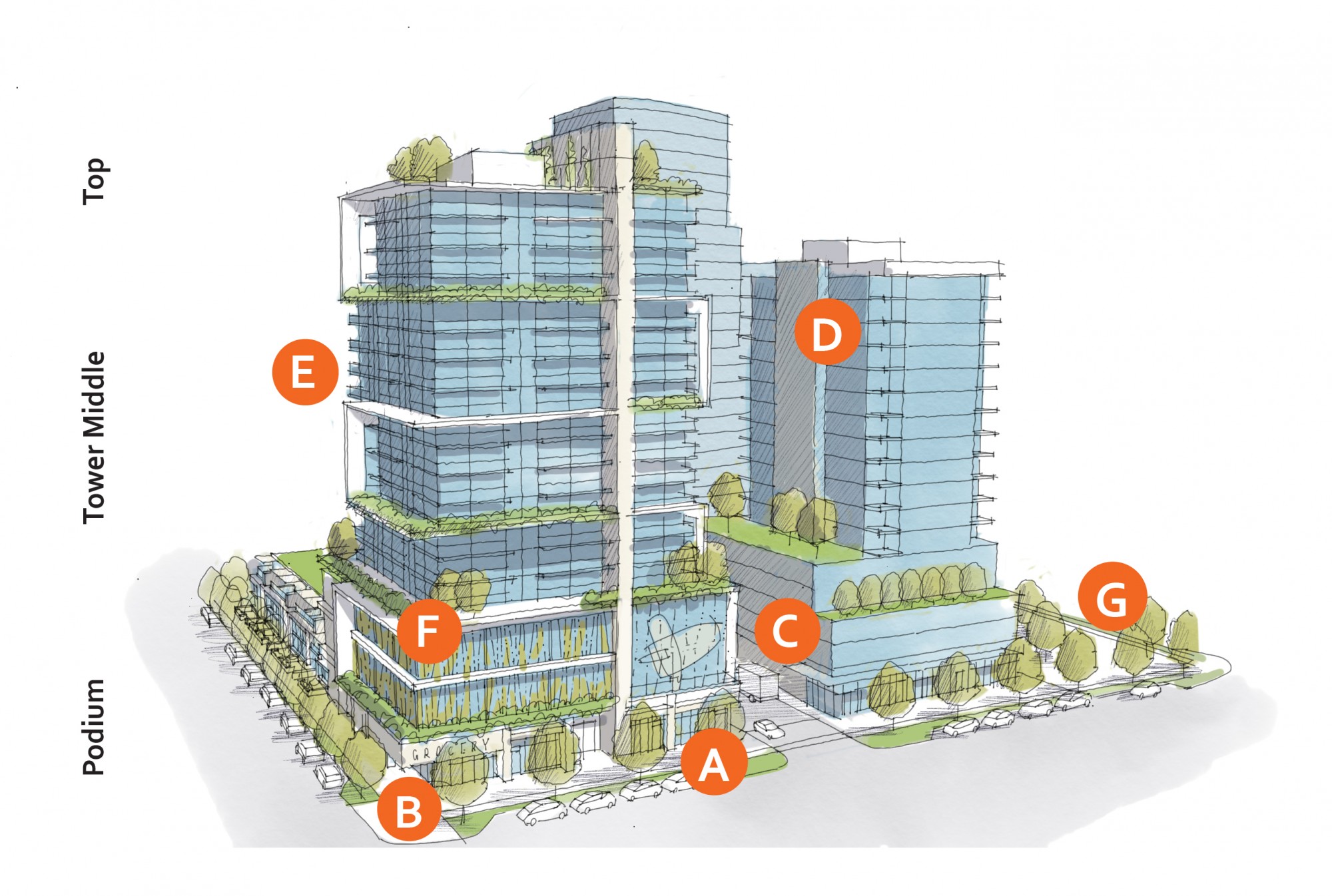
| A | 5.1.0 a – Provide a minimum first floor height of 4.5 m, and limit podium heights to 4 storeys (see 5.1.2). |
| B | 5.1.0 b – Design buildings to activate the street with transparent frontages and commercial, retail, and residential units accessible from the street (see 5.1.1). |
| C | 5.1.0 c – Provide access to parking and loading areas via laneways or secondary streets. Locate structured parking away from street frontages and use store fronts or screening to mitigate visual impacts of upper-storey parking (see 5.1.4). |
| D | 5.1.0 d – Site podiums to frame and activate the street. Site and design towers with appropriate separation (25m) and with slender and simple forms to limit privacy impacts and maximize sunlight access to streets and open spaces (see 5.1.3). |
| E | 5.1.0 e – Design buildings to balance a cohesive architectural look with a distinctly articulated podium, tower, and top (see 5.1.6). |
| F | 5.1.0 f – Break up podium mass by providing simple vertical and horizontal articulation of facades; e.g., stepping back or projecting forward a portion of the facade, using color and texture (see 5.1.6). |
| G | 5.1.0 g – Provide opportunities for mid-block connections, corner plazas, and other open spaces to increase pedestrian connectivity throughout the city (see 5.1.5). |
Design intent: To site and design buildings to positively frame and activate streets and public open spaces.
 |
Guidelines
In addition to the strategies outlined in the General Residential and Mixed Use Guidelines:
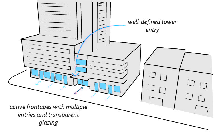
- Design podiums to have transparent frontages to promote ‘eyes on the street’, using strategies such as (See Figure 43):
- Having continuous commercial and retail uses with windows and primary entrances facing the street; and
- Having ground-oriented residential units with windows and primary entrances facing the street.
- For buildings on corner sites with retail frontages, ensure there are active frontages on both facades by wrapping the primary retail facade to the secondary frontage. The primary facade can be emphasized by using higher quality materials and detailing and creating a more prominent entrance (See Figure 44).
- For residential podiums with townhouse frontages, refer to Section 3.1 for Guidelines for that portion of the building.
- Locate private, indoor amenity facilities such as bicycle storage along secondary street frontages as opposed to primary street frontages.
- Blank walls over 5 m in length along a commercial frontage are strongly discouraged and should be avoided.
Building Address and Access
- Use architectural and landscape features to create well-defined, clearly visible, and universally accessible primary building entrances (See Figure 46 on page 37). Additionally:
- Differentiate between residential and commercial entrances;
- Design lobby entryways to ensure they are well-defined and visually emphasized in the facade;
- For retail frontages, provide small format retail storefronts with frequent entrances and a minimum depth of 10 m; and
- Locate main building entries close to transit stops.
Sidewalk Interface
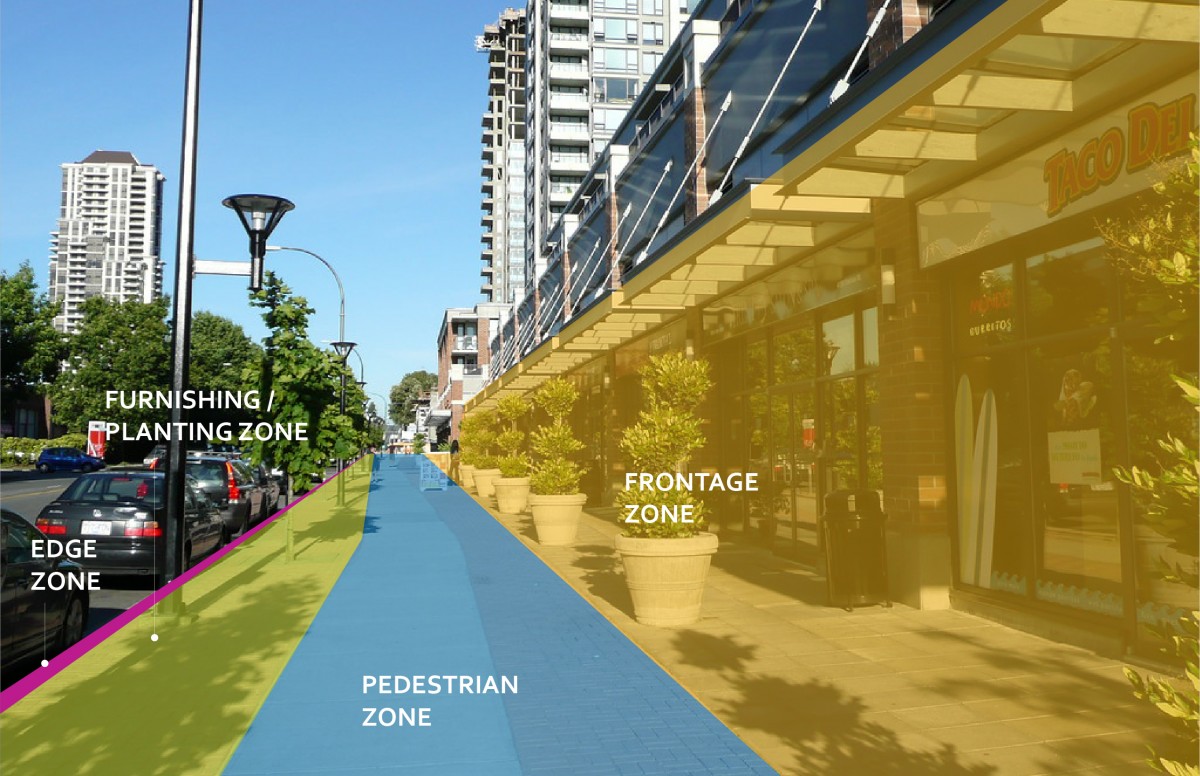
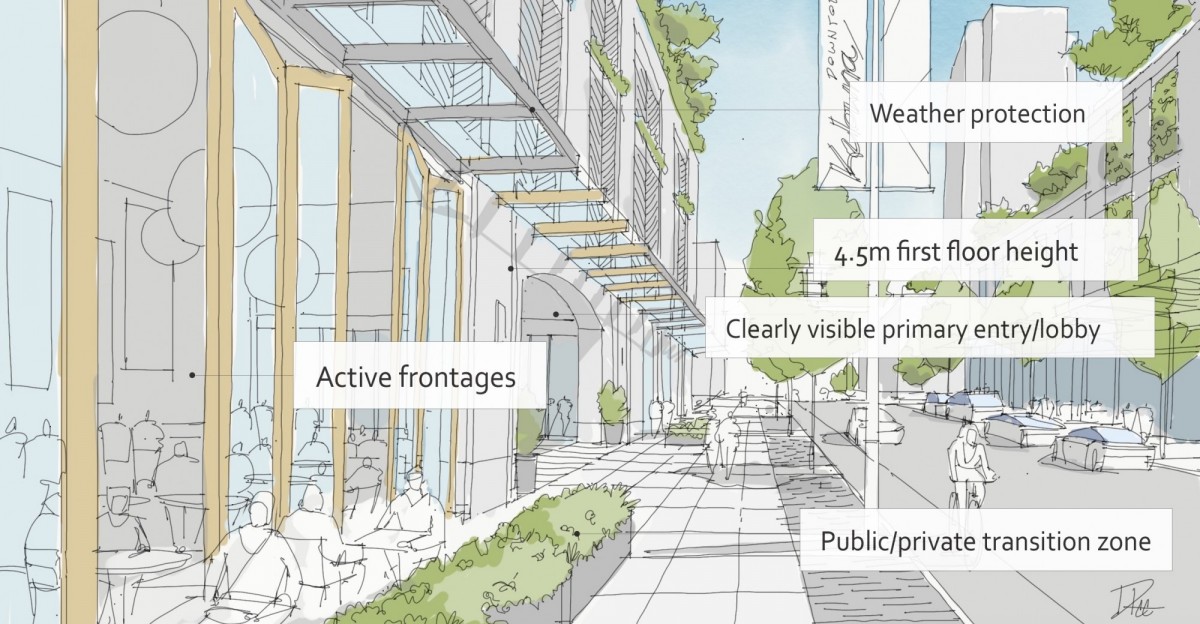
- Design the streetscape fronting buildings to have defined zones as follows (See Figure 45):
- Frontage zone next to the building that may include patios, seating, or space for pedestrians to access building entrances;
- Pedestrian zone that accommodates pedestrians walking along the sidewalk;
- Furnishing / planting zone that provides space for street trees, landscaping, seating and lighting; and
- Edge zone that provides a buffer from moving bicycles and vehicles.
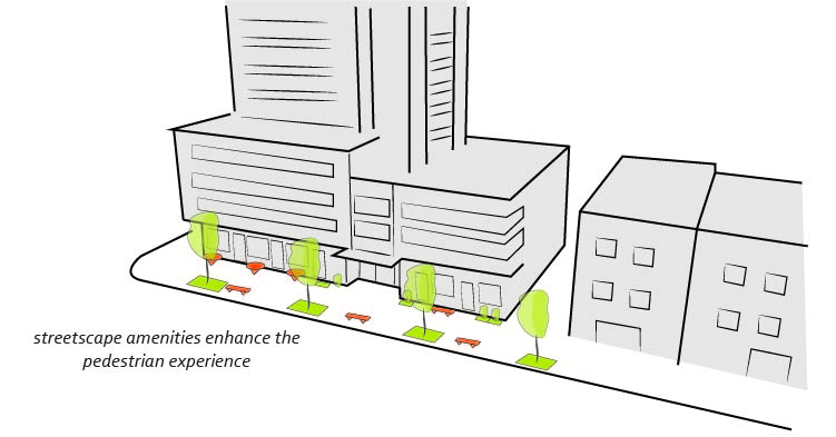
- Provide a generous sidewalk width and space for streetscape amenities such as street trees, benches & patios (See Figure 47).
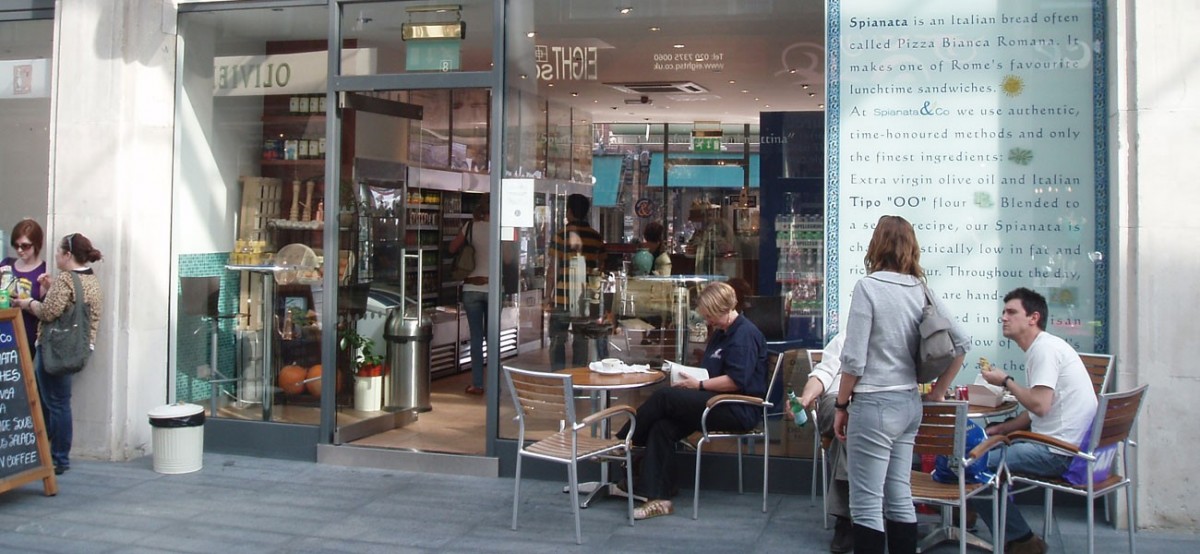 |
| Figure 43: Frequent and transparent entrances into commercial frontages along the street creates visual interest, provides ‘eyes on the street’ and improves the pedestrian experience (5.1.1 a). |
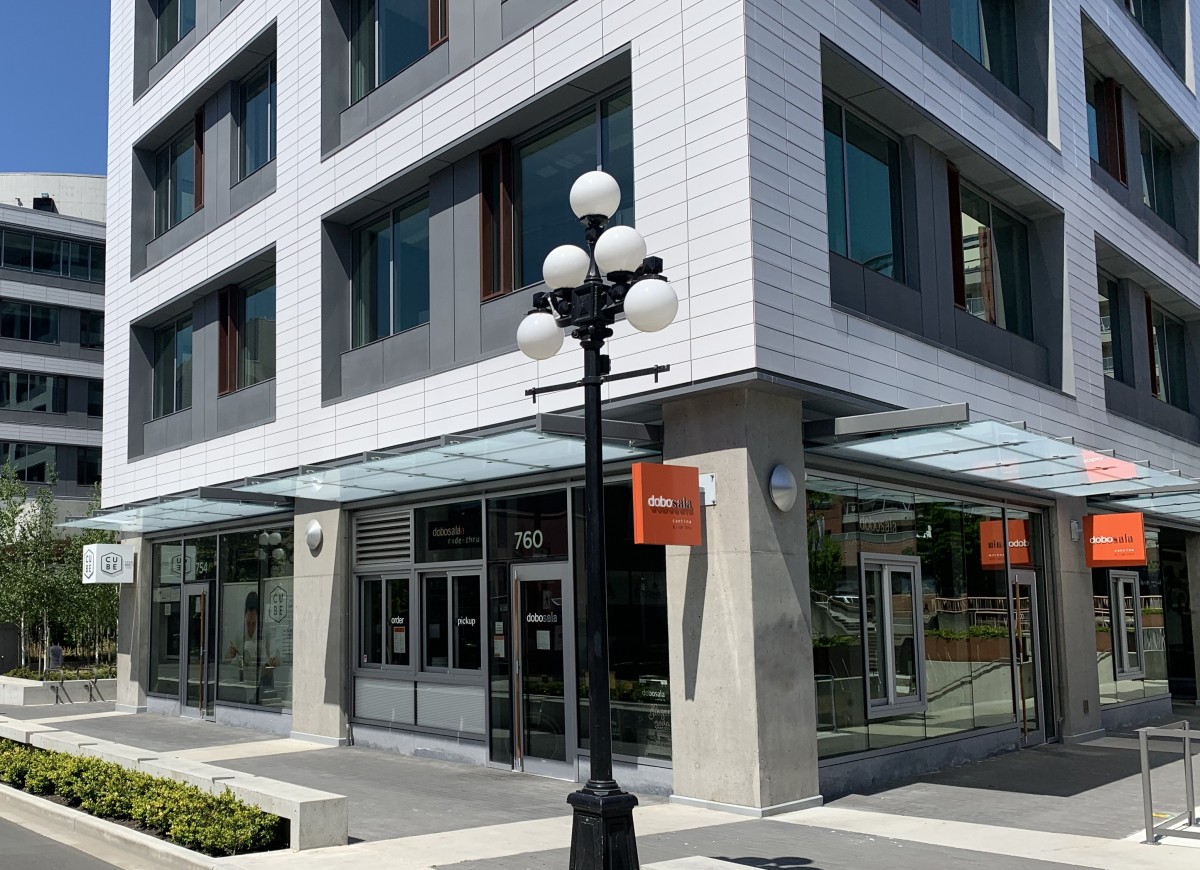 |
| Figure 44: Example of active podium frontage with retail wrapping from primary (left) to secondary (right) frontages (5.1.1 b). |
Design intent: To ensure buildings contribute positively to the neighbourhood context and provide a sensitive transition in scale to existing and future buildings, parks, and open spaces.
Guidelines
In addition to the strategies outlined in the General Residential and Mixed Use Guidelines:
Podium
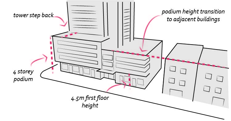
- Provide a minimum first floor height of 4.5 metres, measured from grade (See Figure 48).
- Provide a minimum podium height of 2 storeys and a maximum podium height of 4 storeys, and ensure that the total podium height does not exceed 80% of the adjacent street right-of-way width (See Figure 48).
- On corner sites, vary the height and form of the podium to respect and respond to the height and scale of the existing context on adjacent streets.
- When adjacent sites are lower in height and are not anticipated to change, provide a transition in the podium height down to the lower-scale neighbours (See Figure 48).
- When adjacent sites include heritage buildings, design the scale and height of the podium to align with the heritage building height.
Tower Middle
- When adjacent sites include heritage buildings, design the scale and height of the podium to align with the heritage building height.
- Orient towers in a north/south direction.
- A maximum of four towers should be located within an individual block, with a staggered tower spacing.
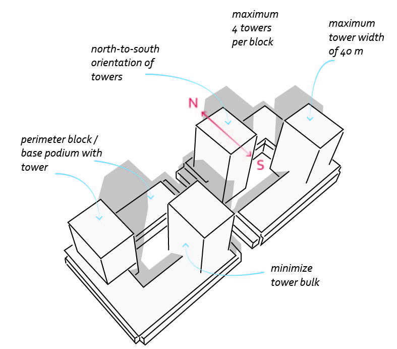 |
| Figure 50: Summary of scale and massing guidelines for podium and tower typologies. |
Design Intent: To site podiums and towers to create a consistent streetwall and minimize visual and shadow impacts on the public realm.
Guidelines
In addition to the strategies outlined in the General Residential and Mixed Use Guidelines:
Building Placement
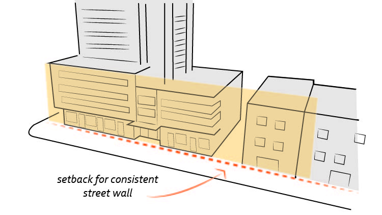
- Site podiums parallel to the street and extend the podium along the edges of streets, parks, and open space to establish a consistent street wall (See Figure 49).
- Additional considerations for building placement include:
- Site towers to be setback from the street wall and closer to the lane.
- Greater setbacks can be provided at strategic points or along the entire frontage for increased architectural interest and improved pedestrian experience, for example to provide space for tree planting, wider sidewalks, plazas, and other open spaces.
- Greater setbacks can be provided along retail streets in order to accommodate street cafes and patios (3-4m).
- On corner sites with retail frontage, provide a triangular setback 4.5m in length abutting along the property lines that meet at each corner of the intersection (See Figure 51).
- Wherever possible, retain existing landscaped streetscapes by providing generous setbacks for trees and plantings.
Building Separation
- Maintain a minimum spacing distance of 25m between towers, measured from the exterior wall of the buildings, excluding balconies (See Figure 52).
- Place towers away from streets, parks, open space, and neighbouring properties to reduce visual and physical impacts of the tower.
Fit and Transition
- Promote fit and transition in scale between tall buildings and lower-scaled buildings, parks, and open spaces by applying angular planes, minimum horizontal separation distances, and other strategies such as building setbacks and stepbacks to limit shadow and visual impacts.
Solar Access
- Orient buildings to maximize solar access to adjacent streets and public spaces, while also considering optimizing for solar orientation to improve energy performance and occupant comfort (see 2.2.1). Strategies for minimizing impact on solar access include:
- Limiting the scale and height of the podium;
- Designing slender towers with generous separation distances;
- Varying the height of towers on sites with multiple towers; and
- Locating towers on site to minimize shadowing adjacent buildings and open spaces.
Views from the Public Realm
- Site buildings to create, frame, or extend views from the public realm to important natural and human-made features (e.g., to Okanagan Lake) by using strategies such as varying setbacks to protect important views.
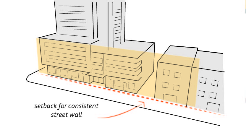 |
| Figure 51: Provide a triangular setback on corner sites with retail frontage (5.1.3 b). |
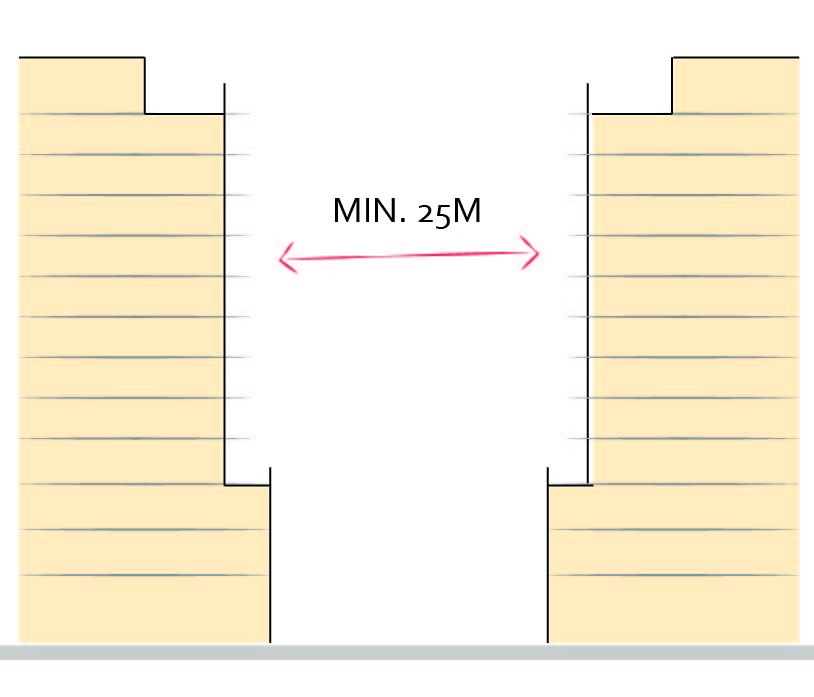 |
| Figure 52: Provide separation distance between towers on the same site of 25m or greater (5.1.3 c). |
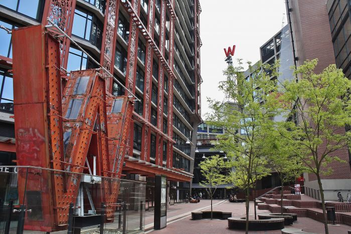 |
| Figure 57: Public art to reflect cultural history of the site and be memorable (5.1.3. I). |
Design Intent: To ensure the provision of adequate servicing, vehicle access, and parking while minimizing adverse impacts on the comfort, safety, and attractiveness of the public realm.
Guidelines
In addition to the strategies outlined in the General Residential and Mixed Use Guidelines:
- Wherever possible, provide access to site servicing and parking at the rear of the building or along a secondary street. Through-lanes are encouraged to minimize the need for vehicle turnarounds on site.
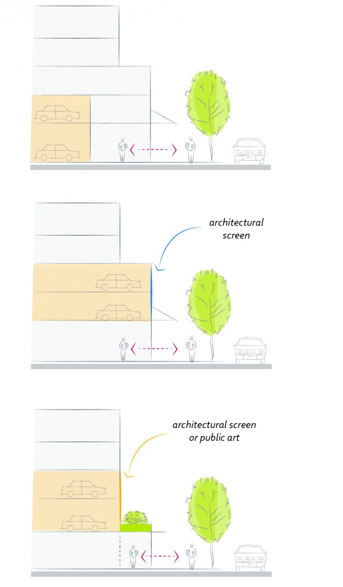
- When parking cannot be located underground due to the high water table and is to be provided above ground, screen the parking structure from public view as follows (See Figure 53):
- On portions of the building that front a retail or main street, line the above ground parking with active retail frontage;
- On portions of the building that front onto non-retail streets, line the above ground parking with an active residential frontage, such as ground oriented townhouse units;
- When active frontages are not able to be accommodated, screen parking structures by using architectural or landscaped screening elements;
- On corner sites, screen the parking structure from public view on both fronting streets using the appropriate strategy listed above.
- An additional acceptable strategy for mitigating visual impacts from above ground parking is to create a setback between the ground floor and upper storeys of the podium that can accommodate significant soil volumes for planting trees and other landscaping to screen the parking structure (see Figure 53).
- Public art can also be used to mitigate visual impacts from blanks walls on upper storey podium levels.
- Minimize the visual impact of garage doors, parking entrances and service openings on the public realm by using strategies such as recessing, screening, and size minimization.
- Avoid split level, raised or sunken parkade entrances.
- Locate drop-off areas into the side or rear of the site and provide pedestrian access to the street frontage.
- Provide clearly visible pedestrian access to and from parking areas.
- Integrate service connections, vents, mechanical rooms and equipment with the architectural treatment of the building, and/or locate to minimize visual impact and screen from view with materials and finishes compatible with the building.
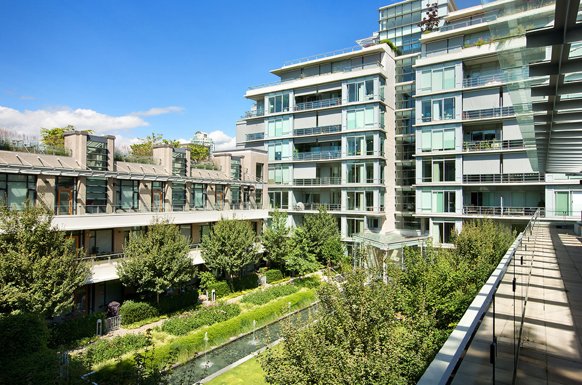 |
| Figure 56: Example of roof garden and private open space (5.1.4 f). |
Design Intent: To design landscapes and open spaces to respond to an open space program that relates to its users and provides flexible, accessible open space.
Guidelines
In addition to the strategies outlined in the General Residential and Mixed Use Guidelines:
Publicly Accessible Open Spaces
- Wherever possible, include publicly accessible open space on-site, such as hard or soft landscaped setbacks, plazas, courtyards, and mid-block pedestrian connections. (See Figure 54 and 55).
- Define and animate the edges of open spaces with well-proportioned podiums and active uses at-grade.
- Locate and design publicly accessible open space to:
- Be directly accessible from the fronting public sidewalk;
- Maximize access to sunlight and encourage year-round use through the use of landscaping, seating, and weather protection;
- Where possible, complement and connect with publicly accessible open space on neighbouring properties; and
- Maximize safety, comfort, amenity, and accessibility.
- On larger sites, use publicly accessible open space to provide through-block pedestrian connections.
- Where provided, tailor furniture elements as appropriate to encourage a range of seating and gathering opportunities, including both fixed and unfixed seating to allow for flexibility of use.
Private Open Spaces
- Provide private outdoor amenity spaces on site, such as balconies, private courtyards, private gardens, and accessible green roofs (See Figure 55 & 56).
- Locate and design shared private outdoor amenity space to:
- Maximize access to sunlight;
- Minimize noise, smell and/or visual impacts from site servicing or mechanical equipment; and
- Provide seating, lighting, trees, shade structures, and weather protection.
- Locate private patios and gardens to minimize overlook from neighbours.
- For shared rooftop amenity spaces (e.g., on the top of the podium parkade), ensure a balance of amenity and privacy by:
- Limiting sight lines from overlooking residential units to outdoor amenity space areas through the use of pergolas or covered areas where privacy is desired; and
- Controlling sight lines from the outdoor amenity space into adjacent or nearby residential units by using fencing, landscaping, or architectural screening.
- Design private balconies to be large enough to provide usable outdoor space.
- Locate indoor amenity areas adjacent to shared outdoor amenity areas and allow access between the two areas.
Public Art
- Where applicable, integrate public art on-site to generate interest and activity and reflect the unique natural, Indigenous, or human history of Kelowna (See Figure 57).
- Provide adequate building setbacks and space to accommodate the pedestrian view and experience of public art installations.
- Site artwork at key pedestrian spaces such as courtyards, mid-block connections, lanes, and plazas.
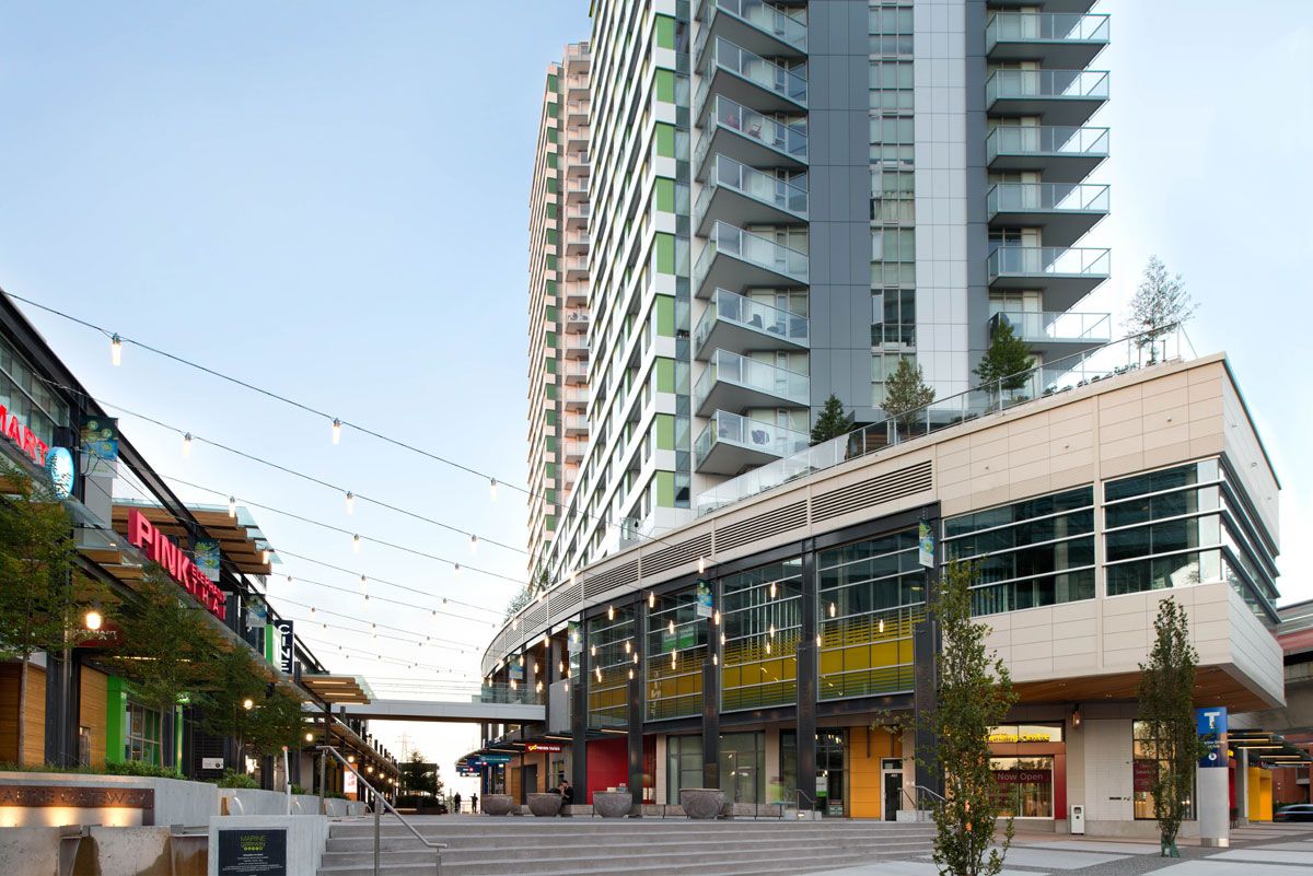 |
| Figure 54: Example of incorporating publicly accessible open space animated by active podium frontages (5.1.5 a-e). |
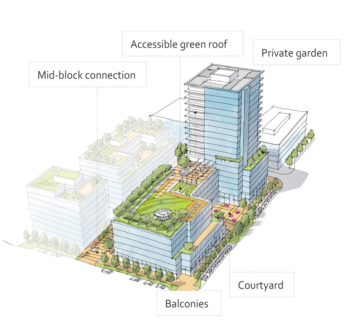 |
| Figure 55: Illustrating a variety of private outdoor amenity spaces as well as publicly accessible open spaces on a high-rise building site (5.1.5 a-k). |
Design Intent: To enhance liveability, visual interest, identity, and sense of place through building form, architectural composition and materials.
Guidelines
In addition to the strategies outlined in the General Residential and Mixed Use Guidelines:
- Design tall buildings to have a cohesive architectural look with a distinct podium, tower, and top. Strategies for achieving this include changes in articulation, materials, and the use of step backs.
Podium
- Provide architectural expression in a pattern, scale and proportion that is in relation to neighbouring buildings and that differentiates it from the tower. Examples of such design elements include the use of:
- Cornice lines
- Window bays;
- Entrances;
- Canopies;
- Durable building materials; and
- Energy efficient fenestration.
- Highlight primary retail facades with high quality materials and detailing, with particular attention to building entrances.
- Avoid blank walls, but if necessary, articulate them with the same materials and design as the other active frontages.
- Along mixed-use and commercial street frontages, avoid locating balconies (projecting or inset) within the first 2 storeys of the podium. Between 3 and 6 storeys, inset balconies behind the streetwall.
- Provide weather protection and signage in accordance with Guidelines found in section 4.1.6 as well as lighting in accordance with section 2.1.5 (See Figure 58).
Tower middle
- On sites with multiple towers, provide variation in the design and articulation of each tower facade to provide visual interest while maintaining a cohesive architecture overall.
- Design balconies to limit increases in the visual mass of the building and to become an extension of interior living space, while balancing the significant potential for heat loss through thermal bridge connections which could impact energy performance (see 2.2.1).
- Consider that inset or partially inset balcony arrangements may offer greater privacy and comfort, particularly on higher floors.
Tower Top
- Consider that inset or partially inset balcony arrangements may offer greater privacy and comfort, particularly on higher floors.
- Design the top of tall buildings to terminate and be distinguishable from the middle building and to make a positive contribution to the skyline (See Figure 60).
- Design and screening of mechanical rooms, and incorporation of roof top amenity spaces and architectural lighting, can be used to distinguish the tower top.
- Setback the upper floors of the tower and incorporate a projecting cornice or other feature to terminate the building and contribute to a varied skyline.
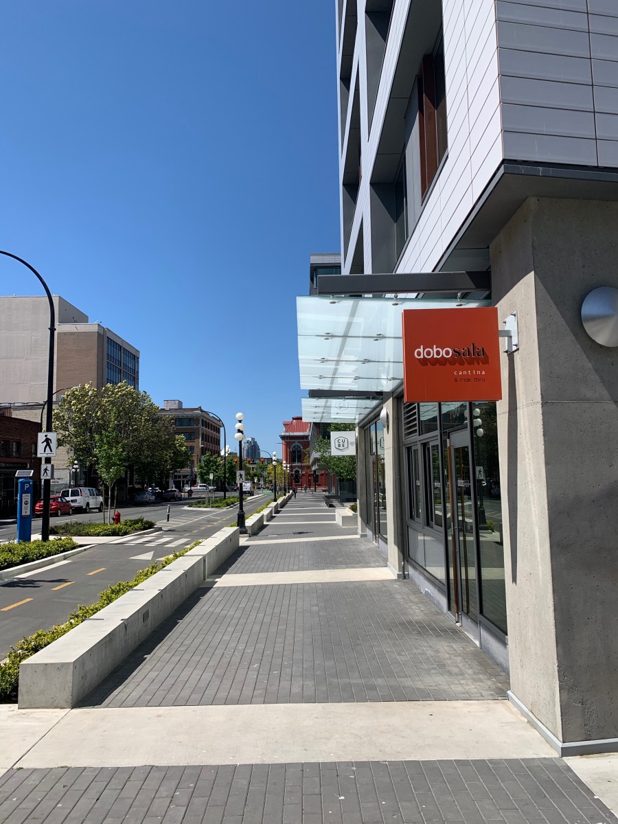 |
| Figure 58: Example of a podium with integrated weather protection and signage at grade (5.1.6. f) . |
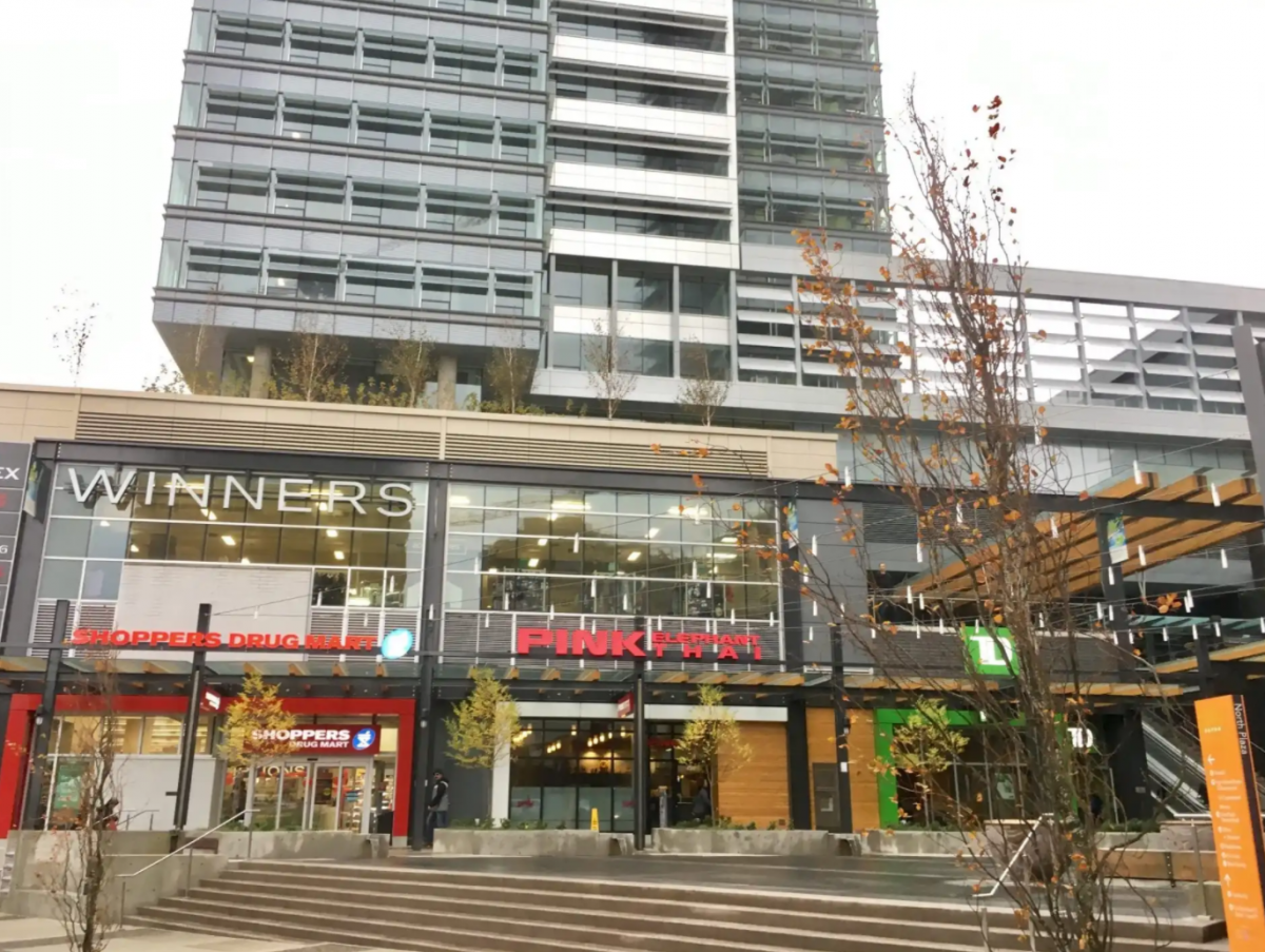 |
| Figure 59: Example of a high rise building with active frontages, high quality materials, and clearly articulated and differentiated podium and tower. |
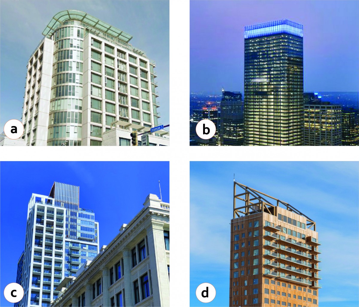 |
| Figure 60: Examples of different approaches to terminating the top of towers: [a] setback on upper floors with architectural feature; [b] architectural lighting; [c] rooftop amenity space with change in materials; [d] screening of mechanical equipment with integrated architectural feature (5.1.6.6 i-j). |


