2040 Official Community Plan - Form & Character
General Residential & Mixed Use Guidelines

Overview | The general residential and mixed use design guidelines capture the key design strategies and elements that should be addressed in all new residential and mixed use projects in the city. They are premised on achieving the design foundations and establish the basis for the more detailed typology-specific project. Both the general design guidelines and the specific guidelines for residential and mixed use building projects apply to each project. |
2.1.0 Key guidelines
Design intent: To site and design buildings to positively frame and activate streets and public open spaces.
In order to achieve the design goals of the City, all residential and mixed use projects must:
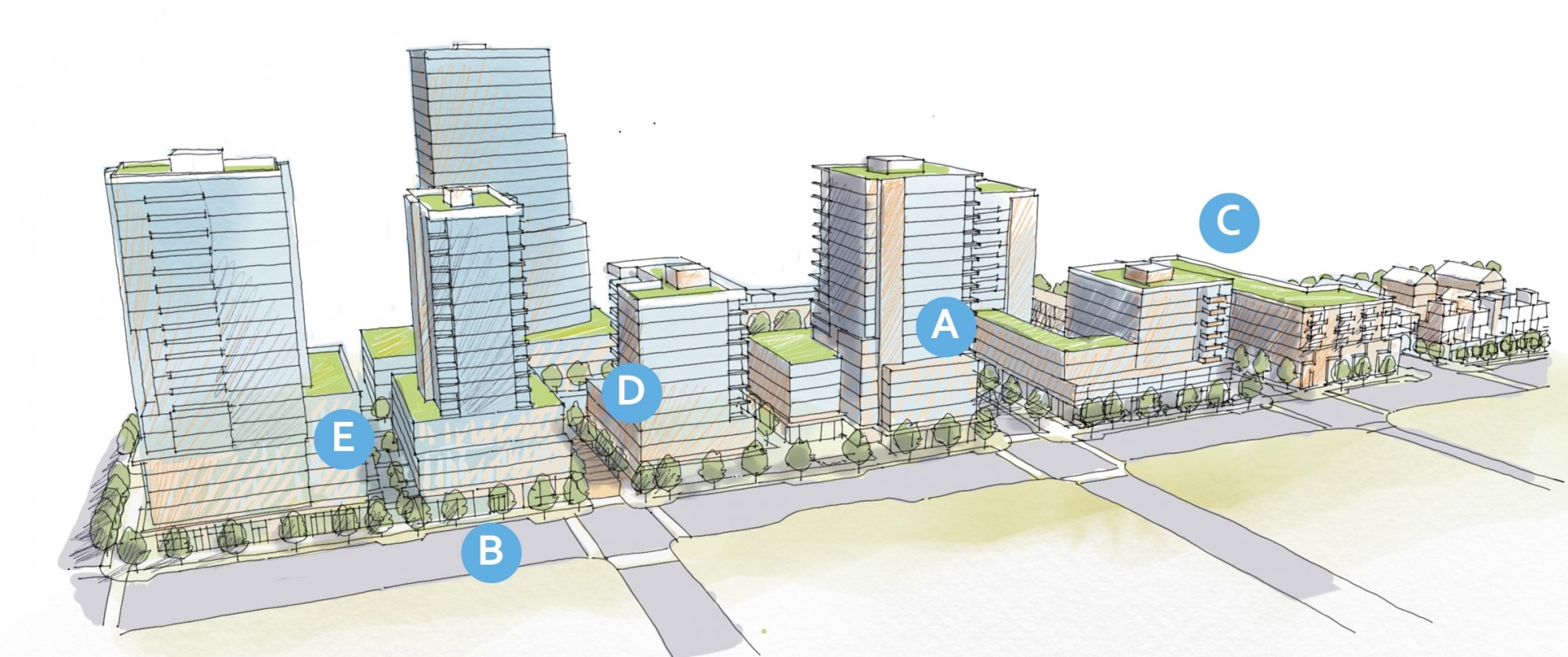
A | 2.1.0 a – Design buildings to frame and activate streets and other open spaces to support walking and cycling, pedestrian comfort, and social interaction |
B | 2.1.0 b – Incorporate high quality building, landscape, and streetscape design to support liveability, sustainability, and sense of place (see also 2.1.5). |
C | 2.1.0 c – Ensure new buildings contribute positively to the envisioned future built form, while being responsive to positive aspects of the existing built environment and sensitive to the natural environment (see also 2.1.2 and 2.1.3). |
D | 2.1.0 d – Provide usable open spaces on site that balance privacy and access and that increase pedestrian connectivity throughout the city (see also 2.1.3 and 2.1.5). |
E | 2.1.0 e – Ensure the provision of adequate servicing, vehicle access, and parking while minimizing negative impacts on the safety and attractiveness of the public realm (see also 2.1.4). |
Design intent: To site and design buildings to positively frame and activate streets and public open spaces.
Guidelines
- Orient primary building facades and entries to the fronting street or open space to create street edge definition and activity (See Figure 1).
- On corner sites, orient building facades and entries to both fronting streets.
- Minimize the distance between the building and the sidewalk to create street definition and a sense of enclosure (See Figure 1).
- Locate and design windows, balconies, and street-level uses to create active frontages and ‘eyes on the street’, with additional glazing and articulation on primary building facades.
- Ensure main building entries are clearly visible with direct sight lines from the fronting street.
- Avoid blank, windowless walls along streets or other public open spaces.
- Avoid the use of roll down panels and/or window bars on retail and commercial frontages that face streets or other public
open spaces. - In general, establish a street wall along public street frontages to create a building height to street width ratio of 1:2, with a minimum ratio of 1:3 and a maximum ratio of 1:1.75 (See Figure 2).
- Wider streets (e.g., transit corridors) can support greater streetwall heights compared to narrower streets (e.g., local streets);
- The street wall does not include upper storeys that are set back from the primary frontage; and
- A 1:1 building height to street width ratio is appropriate for a lane or mid-block connection condition provided the street wall height is no greater then 3 storeys.
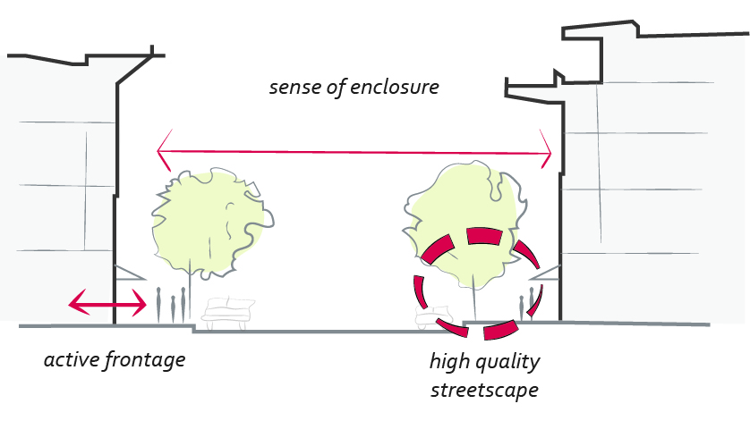 |
| Figure 1: A sense of enclosure, transparent and active shop fronts, and high quality streetscape design are the key ingredients for great streets (2.1.1 a). |
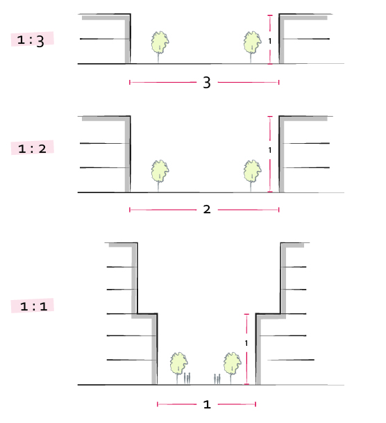 |
| Figure 2: Illustrating different building height to street width ratios (2.1.1 h). |
Design intent: To ensure buildings contribute positively to the neighbourhood context and provide a sensitive transition in scale to existing and future buildings, parks, and open spaces.
Guidelines
- Provide a transition in building height from taller to shorter buildings both within and adjacent to the site with consideration for future land use direction (See Figure 3).
- Break up the perceived mass of large buildings by incorporating visual breaks in facades (See Figure 4).
- Step back the upper storeys of buildings and arrange the massing and siting of buildings to:
- Minimize shadowing on adjacent buildings as well as public and open spaces such as sidewalks, plazas, and courtyards (See Figure 4); and;
- Allow for sunlight onto the outdoor spaces of the majority of ground floor units during the winter solstice.
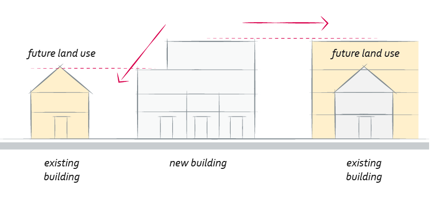 |
| Figure 3: While considering future land use, stepping down building height can provide a sensitive transition in scale to adjacent buildings (2.1.2 a). |
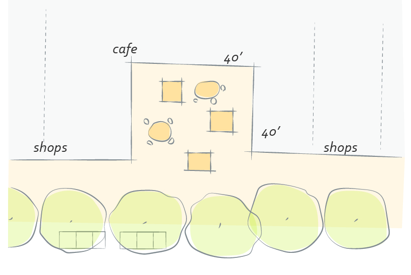 |
| Figure 4: A courtyard can be used to break up the visual mass of large buildings (2.1.2 b) |
Design intent: To site buildings to respond sensitively to topography and environmental features; to enhance privacy, liveability, safety and accessibility; and to increase connectivity to the surrounding open space network.
Guidelines
- Site and design buildings to respond to unique site conditions and opportunities, such as oddly shaped lots, location at prominent intersections, framing of important open spaces, corner lots, sites with buildings that terminate a street end view, and views of natural features.
- Use Crime Prevention through Environmental Design (CPTED) principles to better ensure public safety through the use of appropriate lighting, visible entrances, opportunities for natural surveillance, and clear sight lines for pedestrians.
Relationship to Grade
- Limit the maximum grades on development sites to 30% (3:1).
- Design buildings for ‘up-slope’ and ‘down-slope’ conditions relative to the street by using strategies such as:
- Stepping buildings along the slope, and locating building entrances at each step and away from parking access where possible;
- Incorporating terracing to create usable open spaces around the building;
- Using the slope for under-building parking and to screen service and utility areas (See Figure 5);
- Designing buildings to access key views; and
- Minimizing large retaining walls (retaining walls higher than 1m should be stepped and landscaped).
Connectivity
- Design internal circulation patterns (streets, sidewalks, pathways) to be integrated with and connected to the existing and planned future public street, bicycle and/or pedestrian network (See Figure 6).
- Incorporate easy-to-maintain traffic calming features, such as on-street parking bays and curb extensions, textured materials, and crosswalks.
- Apply universal accessibility principles to primary building entries, sidewalks, plazas, mid-block connections, lanes, and courtyards through the appropriate selection of materials, stairs, and ramps as necessary, and the provision of wayfinding and lighting elements.
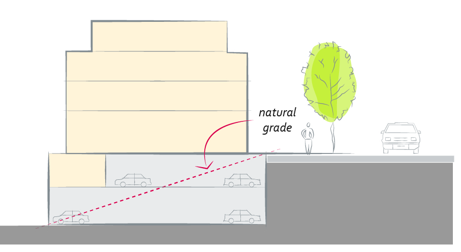 |
| Figure 5: Use natural slope for under-building parking wherever possible (2.1.3 a). |
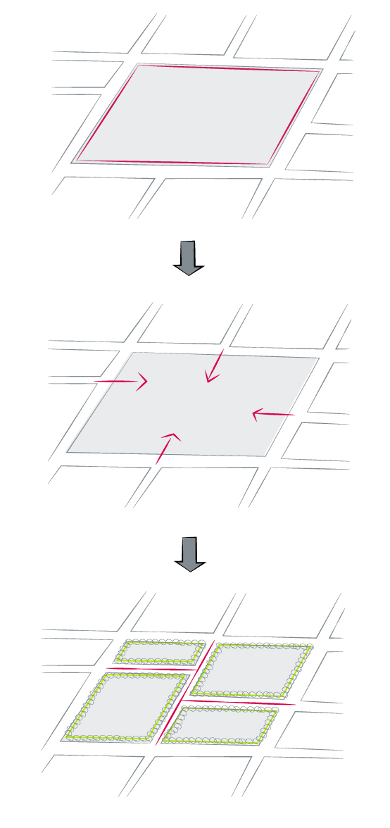 |
| Figure 6: Design internal circulation patterns (streets, sidewalks, pathways) to be integrated with and connected to the existing and planned future public street, bicycle and/or pedestrian network (2.1.3 e). |
Design intent: To ensure the provision of adequate servicing, vehicle access, and parking while minimizing adverse impacts on the comfort, safety and attractiveness of the public realm.
Guidelines
Site Servicing
- Locate off-street parking and other ‘back-of-house’ uses (such as loading, garbage collection, utilities, and parking access) away from public view.
- Ensure utility areas are clearly identified at the development permit stage and are located to not unnecessarily impact public or common open spaces.
Parking
- Avoid locating off-street parking between the front facade of a building and the fronting public street (See Figure 7).
- In general, accommodate off-street parking in one of the following ways, in order of preference:
- Underground (where the high water table allows);
Parking in half-storey (where it is able to be accommodated to not negatively impact the street frontage);
Garages or at-grade parking integrated into the building (located at the rear of the building); and
Surface parking at in the rear, with access from the lane or secondary street wherever possible.
- Design parking areas to maximize rainwater infiltration through the use of permeable materials such as paving blocks, permeable concrete, or driveway planting strips.
- In cases where publicly visible parking is unavoidable, screen using strategies such as (See Figure 8):
- Landscaping;
- Trellises;
- Grillwork with climbing vines; or
- Other attractive screening with some visual permeability.
- Provide bicycle parking at accessible locations on site, including:
- Covered short-term parking in highly visible locations, such as near primary building entrances; and
- Secure long-term parking within the building or vehicular parking area.
Access
- Provide clear lines of site at access points to parking, site servicing, and utility areas to enable casual surveillance and safety.
- Consolidate driveway and laneway access points to minimize curb cuts and impacts on the pedestrian realm or common open spaces.
- Minimize negative impacts of parking ramps and entrances through treatments such as enclosure, screening, high quality finishes, sensitive lighting, and landscaping.
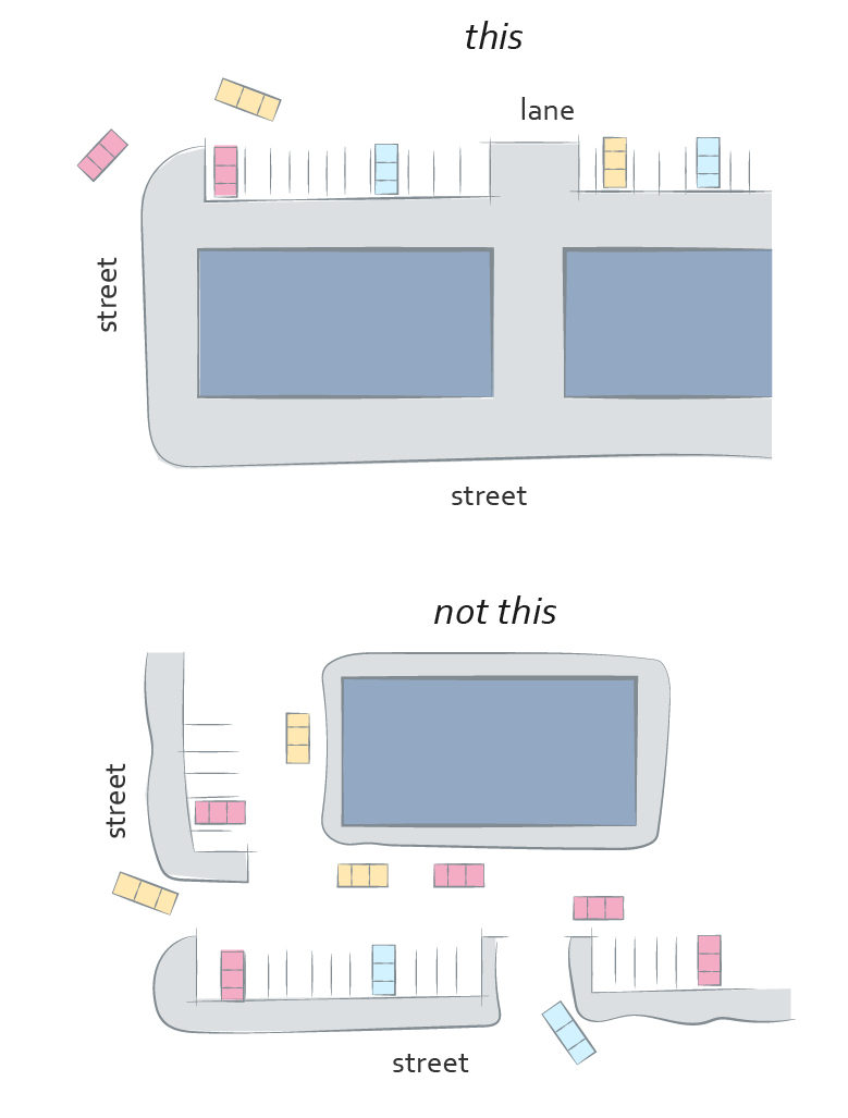 |
| Figure 7: Locate off-street parking to the rear of the building wherever possible (2.1.4 c). |
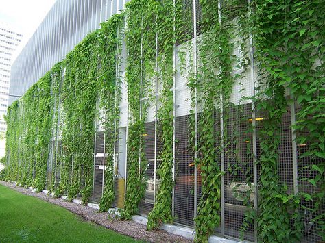 |
| Figure 8: When provided at grade, screen or enclose parking to minimize view and impact on the public realm. (2.1.4 f). |
Design intent: To ensure the design of streets and open spaces creates visual interest, comfort, and safety for pedestrians and positively contributes to urban ecology and stormwater management.
Guidelines
Landscape Planning
a. Site buildings to protect mature trees, significant vegetation, and ecological features.
b. Locate underground parkades, infrastructure, and other services to maximize soil volumes for in-ground plantings.
c. Site trees, shrubs, and other landscaping appropriately to maintain sight lines and circulation (See Figure 9).
d. Design attractive, engaging, and functional on-site open spaces with high quality, durable, and contemporary materials, colors, lighting, furniture, and signage.
e. Ensure site planning and design achieves favourable microclimate outcomes through strategies such as:
- Locating outdoor spaces where they will receive ample sunlight throughout the year;
- Using materials and colors that minimize heat absorption;
- Planting both evergreen and deciduous trees to provide a balance of shading in the summer and solar access in the winter; and
- Using building mass, trees, and planting to buffer wind.
Landscape Materials
f. Use landscaping materials that soften development and enhance the public realm (See Figure 10).
g. Plant native and/or drought tolerant trees and plants suitable for the local climate.
h. Select trees for long-term durability, climate and soil suitability, and compatibility with the site’s specific urban conditions.
Stormwater Management and Water Usage
i. Design sites and landscapes to maintain pre-development flows through capture, infiltration, and filtration strategies, such as the use of rain gardens and permeable surfacing (See Figure 11).
j. Design sites to minimize water use for irrigation by using strategies such as:
- Designing planting areas and tree pits to passively capture rainwater and stormwater run-off; and
- Using recycled water irrigation systems.
Sustainable Materials and Furniture
k. Create multi-functional landscape elements wherever possible, such as planting areas that also capture and filter stormwater or landscape features that users can interact with.
l. Select materials and furnishings that reduce maintenance requirements and use materials and site furnishings that are sustainably sourced, re-purposed, or 100% recycled.
Lighting and Wayfinding
m. Use exterior lighting to complement the building and landscape design, while (See Figure 12):
- Minimizing light trespass onto adjacent properties;
- Using full cut-off lighting fixtures to minimize light pollution; and
- Maintaining lighting levels necessary for safety and visibility.
n. Employ on-site wayfinding strategies that create attractive and appropriate signage for pedestrians, cyclists, and motorists using a ‘family’ of similar elements.
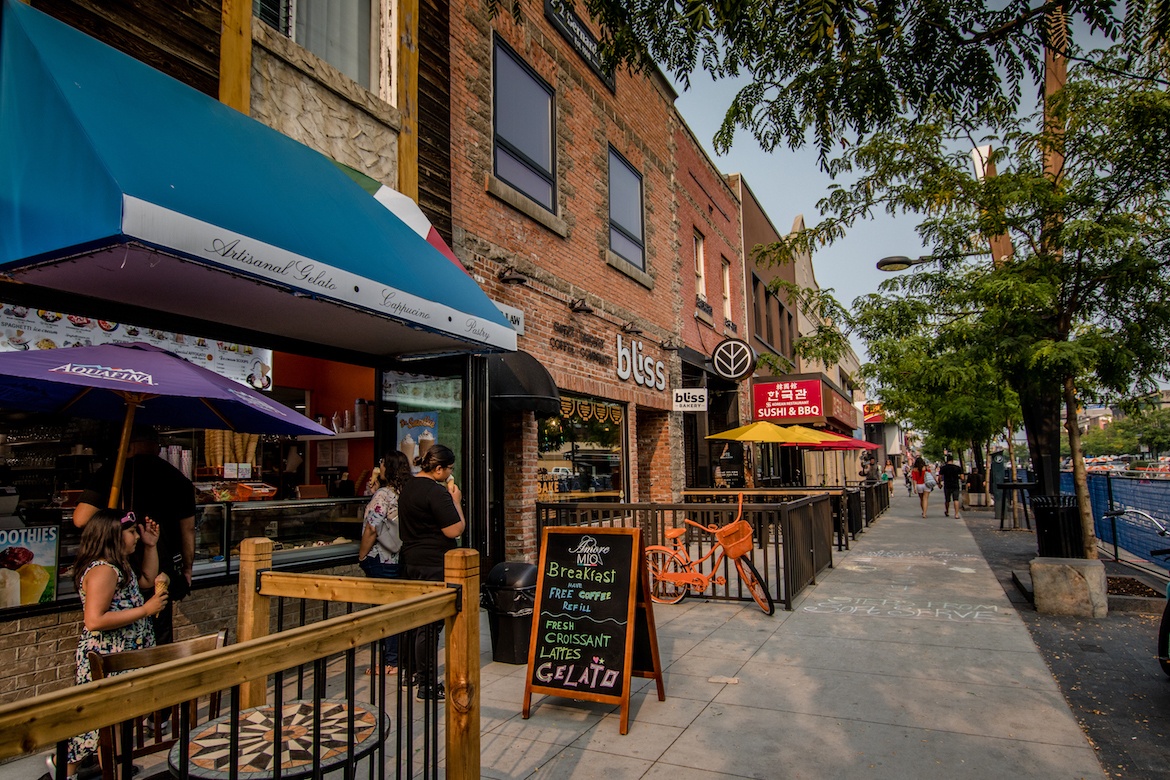 |
| Figure 9: Site trees and other landscaping to maintain sight lines and circulation (2.1.5 c) |
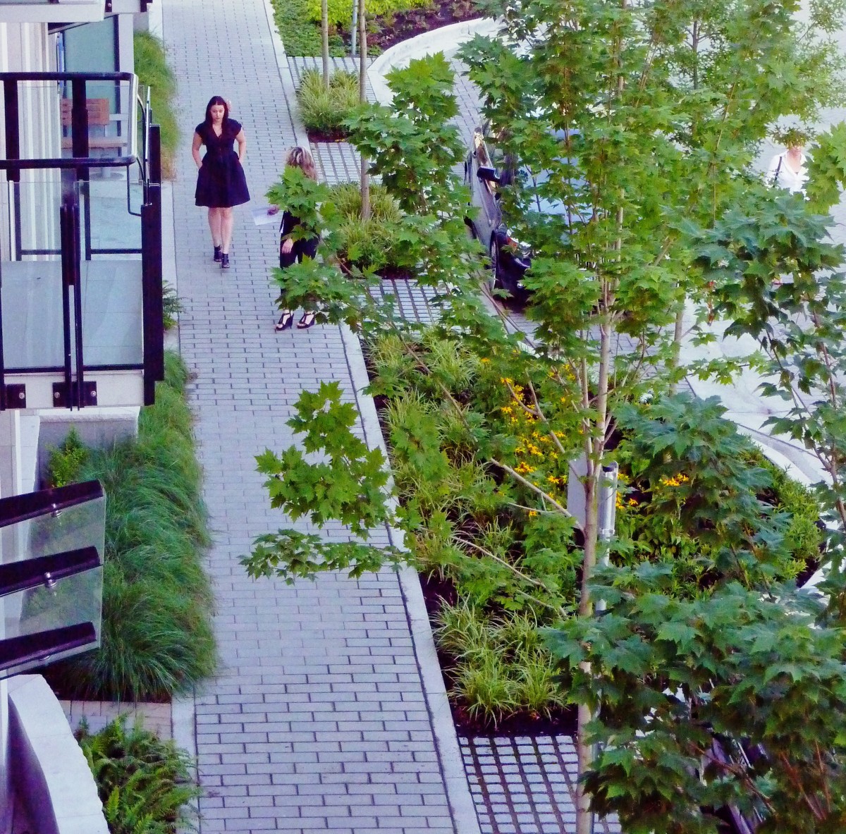 |
| Figure 10: Use landscaping materials that soften development and enhance the public realm (2.1.5 f). |
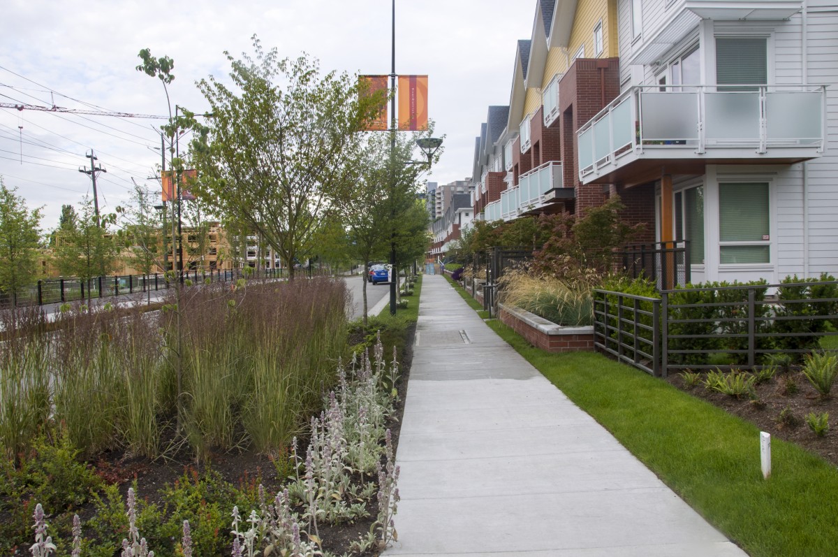 |
| Figure 11: Design sites and landscapes to maintain pre-development flows using strategies such as rain gardens and permeable surfacing (2.1.5 i). |
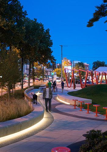 |
| Figure 12: Use full cut-off exterior lighting to complement building and landscape design (2.1.5 m). |
Design intent: To enhance liveability, visual interest, identity, and sense of place through building form, architectural composition and materials.
Guidelines
a. Express a unified architectural concept that incorporates variation in facade treatments.
Strategies for achieving this include:
- Articulating facades by stepping back or extending forward a portion of the facade to create a series of intervals or breaks;
- Repeating window patterns on each step-back and extension interval;
- Providing a porch, patio, deck, covered entry, balcony and/or bay window for each interval; and
- Changing the roof line by alternating dormers, stepped roofs, gables, or other roof elements to reinforce each interval.
b. Incorporate a range of architectural features and details into building facades to create visual interest, especially when approached by pedestrians. Include architectural features such as:
- Bay windows and balconies;
- Corner feature accents, such as turrets or cupolas;
- Variations in roof height, shape and detailing;
- Building entries; and
- Canopies and overhangs.
Include architectural details such as:
- Masonry such as tiles, brick, and stone;
- Siding including score lines and varied materials to distinguish between floors;
- Articulation of columns and pilasters;
- Ornamental features and art work;
- Architectural lighting;
- Grills and railings;
- Substantial trim details and moldings / cornices; and
- Trellises, pergolas and arbors.
c. Design buildings to ensure that adjacent residential properties have sufficient visual privacy (e.g. by locating windows to minimize overlook and direct sight lines into adjacent units), as well as protection from light trespass and noise.
d. Design buildings such that their form and architectural character reflect the buildings internal function and use.
Materials
e. Incorporate substantial, natural building materials such as masonry, stone, and wood into building facades (See Figure 13).
Weather protection
f. Provide weather protection such as awnings and canopies at primary building entries
g. Place weather protection to reflect the building’s architecture.
Signage
h. Limit signage in number, location, and size to reduce visual clutter and make individual signs easier to see.
i. Provide visible signage identifying building addresses at all entrances.
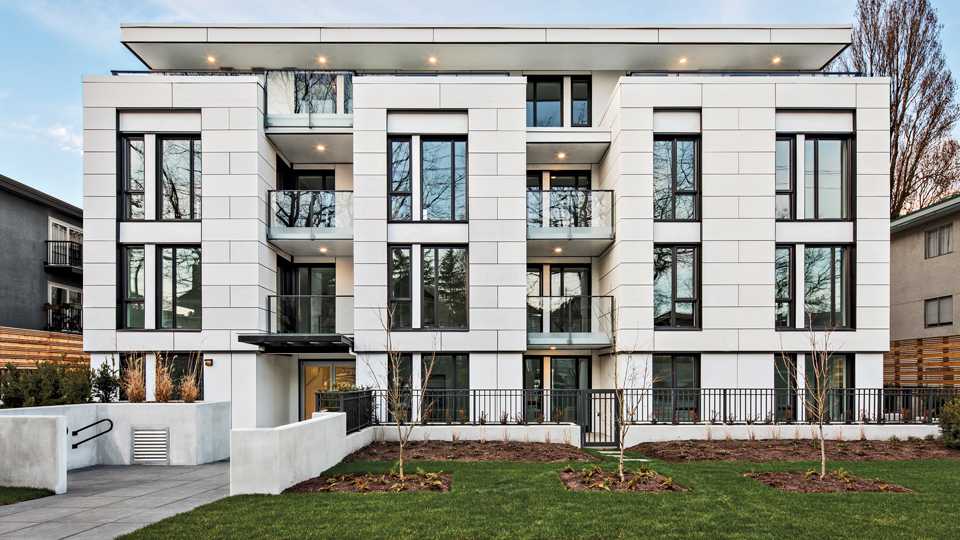 |
| A low-rise building demonstrating a unified architectural concept with clear building intervals with balconies and repeating window patterns. |
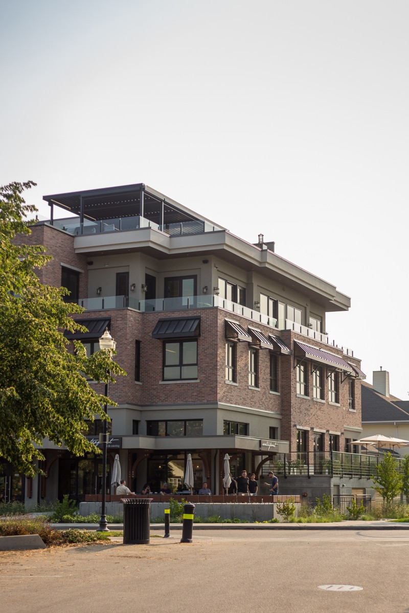 |
| Figure 13: Incorporate substantial, natural building materials such as masonry, stone, and wood into building facades (2.1.6 d). |
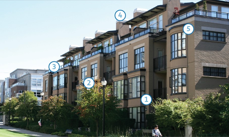
This building demonstrates several guidelines related to building articulation and features (see 2.1.6 a - b), including:
| 1 | Stepping back or extending forward a portion of the facade to create a series of intervals |
| 2 | Repeating window patterns on each extension interval |
| 3 | Providing a balcony at each interval |
| 4 | Providing a stepped roof to reinforce each interval |
| 5 | Providing cornice details |
Design intent: To design buildings to reduce energy demand and maximize occupant health and comfort, while ensuring visual interest.
Guidelines
Simplified Massing
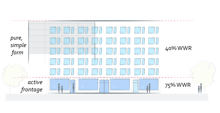
a. Design buildings with a pure form with simplified massing and fewer complex junctions to minimize building envelope heat loss.
Articulation
b. Use simple shifts in massing and changes in exterior colors and textures to articulate facades.
c. For larger buildings, target an overall window-to-wall ratio (WWR) of 40% to reduce heat gain and loss through the building envelope by increasing the area of insulated wall (See Figure 14). Additional considerations include:
- WWR ratios should be higher at grade to promote at-grade transparency while accommodating the 40% WWR in the building overall; and
- WWR ratios should be lower on north facing facades than on south facing facades to account for lower solar gain potential.
Site Planning and Orientation
d. Incorporate passive heating, cooling, and lighting design principles in landscape and building design, including:
- Orienting for maximum solar-gain potential from the south to reduce heating demand in colder months; and
- Using trees to provide natural shading to reduce overheating in warmer months.
e. Use appropriately designed exterior shading devices to block unwanted solar gains in warmer months while welcoming solar gains from lower winter sunlight. Additional considerations include (See Figure 16):
- Their use should be prioritized on southern elevations;
- Shading is not necessary on north-facing facades; and
- Vertical fins are a good strategy to use for blocking incoming summer sun on western elevations.
High Performance Building Envelope
f. Use insulating materials and/or thermally broken building products to reduce building heat loss from thermal bridges such as concrete balconies and beams that run from the building’s interior to exterior.
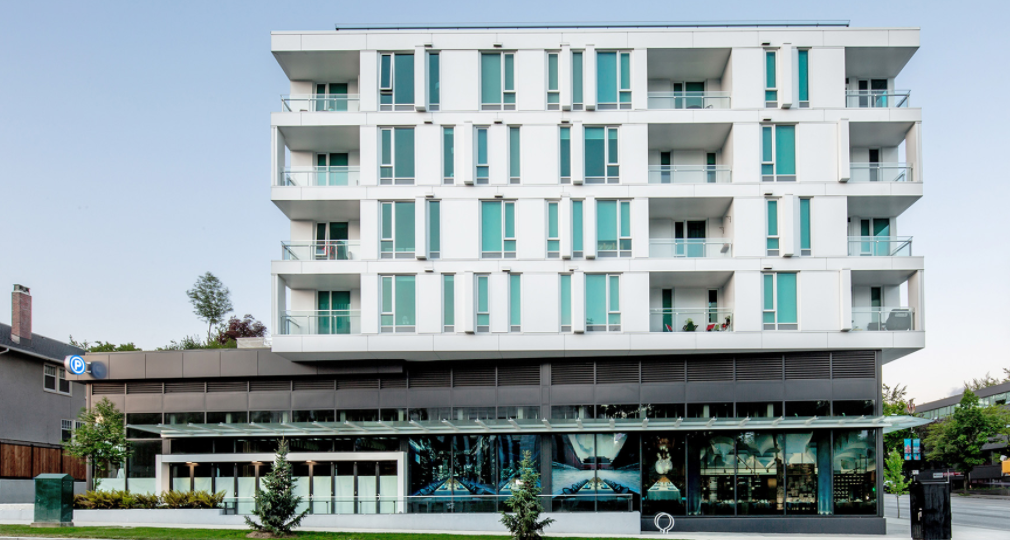 |
| Figure 15: Example of a building with active frontage and low WWR above. |
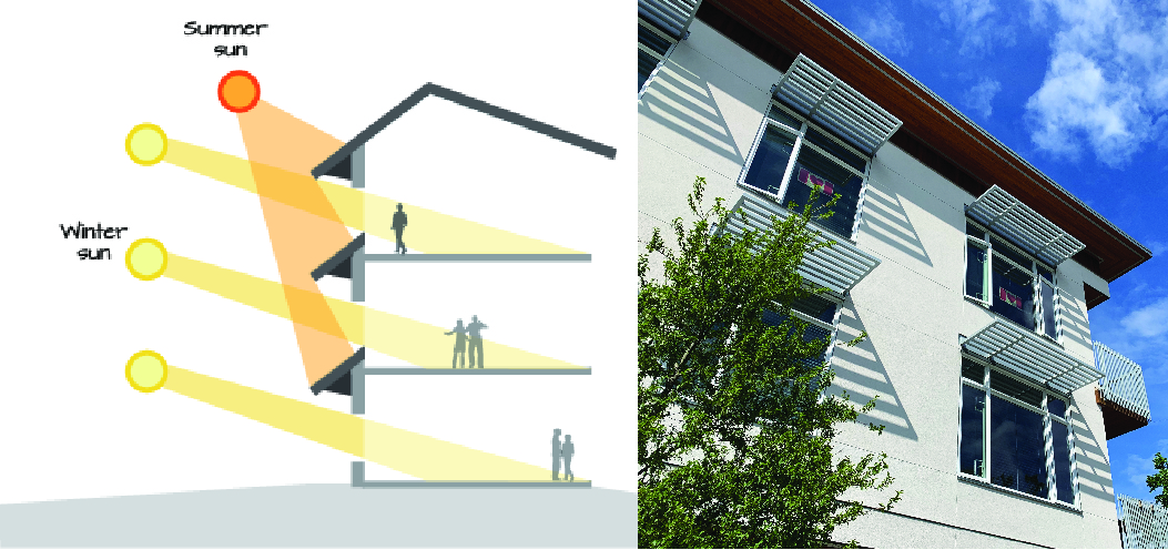 |
| Figure 16: Exterior shading devices can be integrated into a building’s southern elevation to block unwanted solar gains and keep indoor temperatures comfortable in warmer months (2.2.1 e). |
The BC Energy Step Code establishes measurable energy efficiency requirements for new construction, up to net-zero energy ready performance by the year 2032. Over time, and supported by ongoing industry engagement, the City of Kelowna intends to incrementally raise minimum energy performance to the highest levels of the Step Code in advance of 2032. Changes to form and character are not required to meet the performance requirements of the Lower Steps of the Step Code, but will be required to meet the requirements of the Upper Steps of the Step Code.
The Step Code is performance-based, which allows designers flexibility on how to balance project conditions and constraints (e.g., building code, urban design guidelines, site characteristics) in order to meet energy performance targets. The guidelines in this section are meant to provide guidance and flexibility so that designers are able to achieve high performance design alongside urban design best practices.
For more details on designing buildings to meet Step Code performance requirements, including mechanical design, air tightness strategies, envelope details and other strategies that do not impact form and character, please see BC Housing’s BC Energy Step Code Design Guide.
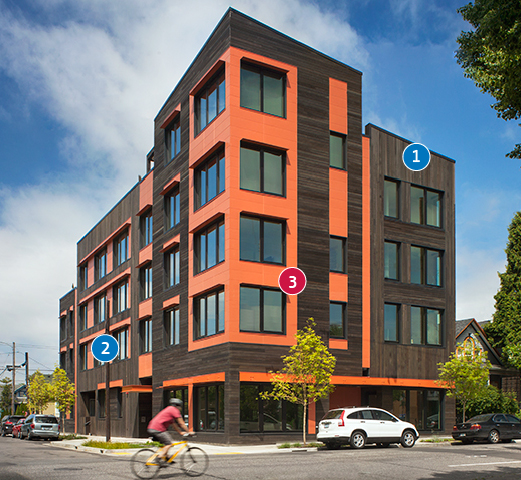
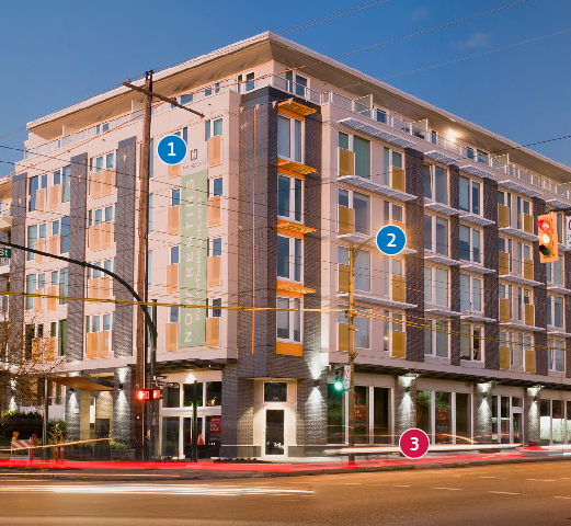
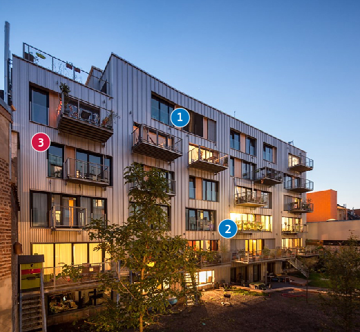
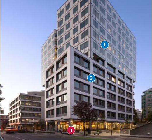
Well Designed High Performance Buildings | |
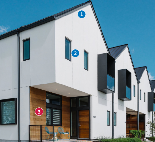
| These precedent photos demonstrate best practices in high performance building design in common building typologies. All projects shown are designed to meet or exceed the equivalent performance requirements of the highest Step of the BC Energy Step Code. Design professionals can use a wide variety of strategies – such as exterior colors, textures, and simple shifts in massing – to create aesthetically pleasing high performance buildings. Design principles such as achieving a strong relationship to the street and a unified architectural expression need not be sacrificed. | |
| Blue circles = High Performance Design Strategy Red circles = Alignment with Design Principles | |
Townhouse
|  |
Mid-rise Residential
|  |
Mid-rise Mixed Use
|  |
Mid-rise Residential
|  |
Commercial Mixed Use
|  |


